8.2. Lesson: 래스터 심볼 변경
모든 래스터 데이터가 항공사진인 것은 아닙니다. 다른 형식의 래스터 데이터도 많이 있으며, 대부분의 경우, 데이터를 적절히 심볼화해서 제대로 활용할 수 있도록 표출하는 작업이 필요합니다.
이 강의의 목표: 래스터 레이어를 위해 심볼을 변경하기.
8.2.1.  Try Yourself
Use the Browser Panel to load the new raster dataset;
Load the dataset
srtm_41_19_4326.tif, found under the directoryexercise_data/raster/SRTM/;Once it appears in the Layers Panel, rename it to
DEM;Zoom to the extent of this layer by right-clicking on it in the Layer List and selecting Zoom to Layer.
이 데이터셋은 수치 표고 모델(Digital Elevation Model, DEM) 입니다. 지형의 표고(고도)를 표현하는 맵으로, 예를 들면 산과 계곡의 위치를 볼 수 있게 해줍니다.
While each pixel of dataset of the previous section contained color information, in a DEM file, each pixel contains elevation values.
Once it’s loaded, you’ll notice that it’s a basic stretched grayscale representation of the DEM:
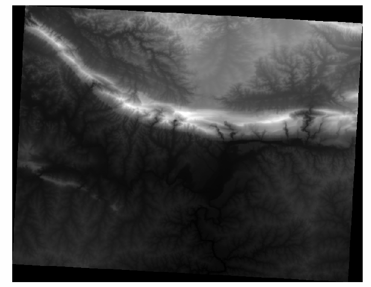
QGIS는 시각화 목적을 위해 자동적으로 이미지에 구간을 적용합니다. 이번 실습을 계속하면서 이것이 어떻게 작용하는지 배우게 될 것입니다.
8.2.2. Follow Along: 래스터 레이어 심볼 변경
You have basically two different options to change the raster symbology:
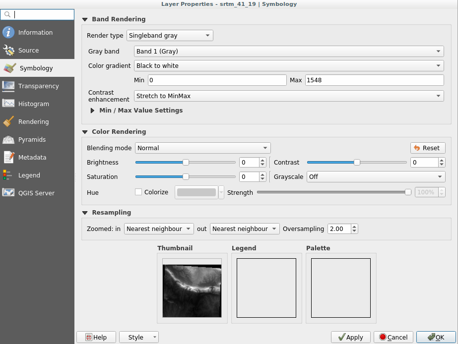
Within the Layer Properties dialog for the DEM layer by right-clicking on the layer in the Layer tree and selecting Properties option. Then switch to the Symbology tab;
By clicking on the
 button right above the Layers Panel.
This will open the Layer Styling anel where you can switch to the
Symbology tab.
button right above the Layers Panel.
This will open the Layer Styling anel where you can switch to the
Symbology tab.
Choose the method you prefer to work with.
8.2.3. Follow Along: Singleband gray
When you load a raster file, if it is not a photo image like the ones of the previous section, the default style is set to a grayscale gradient.
Let’s explore some of the features of this renderer.
The default Color gradient is set to Black to white, meaning
that low pixel values are black and while high values are white. Try to invert
this setting to White to black and see the results.
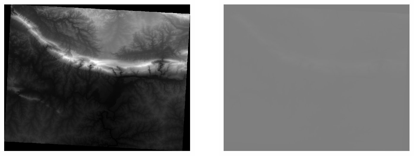
Very important is the Contrast enhancement parameter: by default it
is set to Stretch to MinMax meaning that the grayscale is stretched to the
minimum and maximum values.
Look at the difference with the enhancement (left) and without (right):
But what are the minimum and maximum values that should be used for the stretch? The ones that are currently under Min / Max Value Settings. There are many ways that you can use to calculate the minimum and maximum values and use them for the stretch:
User Defined: you choose both minimum and maximum values manually;
Cumulative count cut: this is useful when you have few extreme low or high values. It cuts the
2%(or the value you choose) of these values;Min / max: the real minimum and maximum values of the raster;
Mean +/- standard deviation: the values will be calculated according to the mean value and the standard deviation.
8.2.4. Follow Along: Singleband pseudocolor
Grayscales are not always great styles for raster layers. Let’s try to make the DEM layer more colorful.
Change the Render type to Singleband pseudocolor: if you don’t like the default colors loaded, click on Color ramp and change them;
Click the Classify button to generate a new color classification;
If it is not generated automatically click on the OK button to apply this classification to the DEM.

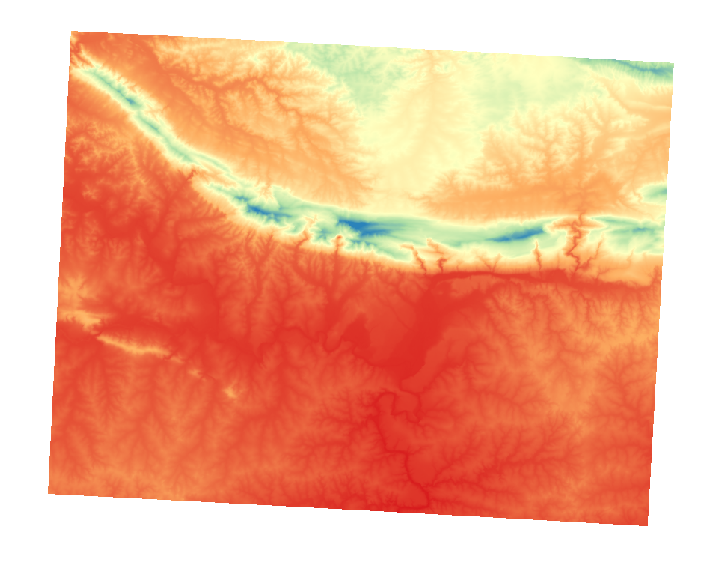
래스터가 다음과 같이 보이게 됩니다.
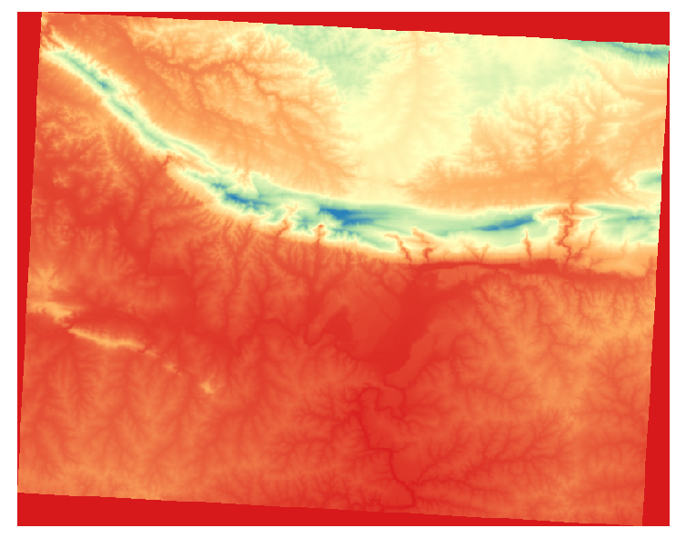
This is an interesting way of looking at the DEM. You’ll now see that the values of the raster are again properly displayed, with the darker colors representing valleys and the lighter ones, mountains.
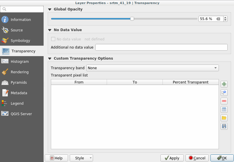
8.2.5. Follow Along: Changing the transparency
Sometimes changing the transparency of the whole raster layer can help you to see other layers covered by the raster itself and better understand the study area.
To change the transparency of the whole raster switch to the Transparency tab and use the slider of the Global Opacity to lower the opacity:
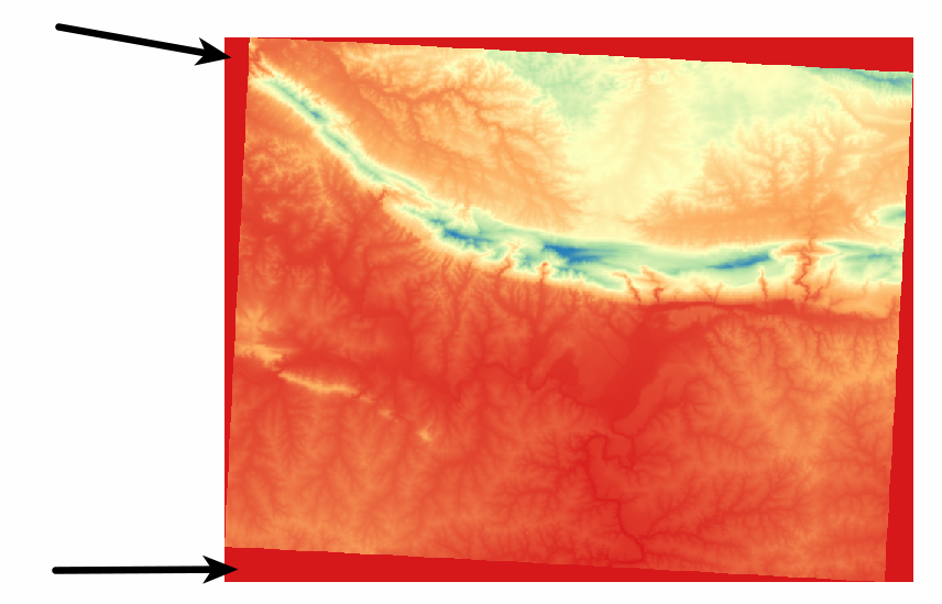
More interesting is changing the transparency of single pixels. For example in the raster we used you can see an homogeneous color at the corners:
To set this values as transparent, the Custom Transparency Options menu in Transparency has some useful methods:
By clicking on the
 button you can add a range of values and set the
transparency percentage of each range chosen;
button you can add a range of values and set the
transparency percentage of each range chosen;For single values the
 button is more useful;
Click on the
button. The dialog disappearing and you can
interact with the map;Click on a corner of the raster file;
You will see that the transparency table will be automatically filled with the clicked values:
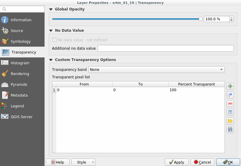
Click on OK to close the dialog and see the changes.
See? The corners are now 100% transparent.
8.2.6. In Conclusion
These are only the basic functions to get you started with raster symbology. QGIS also allows you many other options, such as symbolizing a layer using paletted/unique values, representing different bands with different colors in a multispectral image or making an automatic hillshade effect (useful only with DEM raster files).
8.2.7. 참조
SRTM 데이터셋의 출처는 http://srtm.csi.cgiar.org/ 입니다.
8.2.8. What’s Next?
이제 데이터를 제대로 표출할 수 있게 됐으니, 어떻게 더 심도 있게 분석할 수 있을지 알아보겠습니다.