Fenêtre Propriétés d’une couche raster
Pour voir et définir les propriétés d’une couche raster, double-cliquez sur le nom de la couche dans la légende de la carte ou faites un clic-droit son nom et choisissez Propriétés dans le menu qui apparaît.
La fenêtre Propriétés de la couche s’ouvre alors (voir figure_raster_1).
Il y a plusieurs onglets dans cette fenêtre :
Général
- Style
Transparence
Pyramides
Histogramme
Métadonnées
Figure Raster 1:

Fenêtre de Propriétés des couches raster 
Onglet Style
Rendu des bandes raster
QGIS propose quatre Types de rendu. Le choix s’effectue en fonction du type de données.
- Multiband color - if the file comes as a multi band with several bands (e.g. used with a satellite image with several bands)
- Paletted - if a single band file comes with an indexed palette (e.g. used with a digital topographic map)
- Singleband gray- (one band of) the image will be rendered as gray, QGIS will choose this renderer if the file neither has multi bands, nor has an indexed palette nor has a continous palette (e.g. used with a shaded relief map)
- Singleband pseudocolor - this renderer is possible for files with a continuous palette, e.g. the file has got a color map (e.g. used with an elevation map)
Couleur à bandes multiples
With the multiband color renderer three selected bands from the image will be rendered, each band representing the red, green or blue component that will be used to create a color image. You can choose several Contrast enhancement methods: ‘No enhancement’, ‘Stretch to MinMax’, ‘Stretch and clip to MinMax’ and ‘Clip to min max’.
Figure Raster 2:
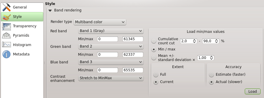
Rendu Raster - Couleur à bandes multiples
This selection offers you a wide range of options to modify the appearance
of your rasterlayer. First of all you have to get the data range from your
image. This can be done by choosing the Extent and pressing
[Load]. QGIS can  Estimate (faster) the
Min and Max values of the bands or use the
Estimate (faster) the
Min and Max values of the bands or use the
 Actual (slower) Accuracy.
Now you can scale the colors with the help of the Load min/max values section.
A lot of images have few very low and high data. These outliers can be eliminated
using the Cumulative count cut setting. The standard data range is set
from 2% until 98% of the data values and can be adapted manually. With this
setting the gray character of the image can disappear.
With the scaling option Min/max QGIS creates a color table with
the whole data included in the original image. E.g. QGIS creates a color table
with 256 values, given the fact that you have 8bit bands.
You can also calculate your color table using the Mean +/- standard deviation x  .
Then only the values within the standard deviation or within multiple standard deviations
are considered for the color table. This is useful when you have one or two cells
with abnormally high values in a raster grid that are having a negative impact on
the rendering of the raster.
.
Then only the values within the standard deviation or within multiple standard deviations
are considered for the color table. This is useful when you have one or two cells
with abnormally high values in a raster grid that are having a negative impact on
the rendering of the raster.
All calculation can also be made for the Current extend.
Astuce
Visualiser une seule bande d’un raster multibande
Si vous désirez visualiser une seule bande (par exemple la bande rouge) d’une image multibande, vous pouvez penser que vous pourriez définir les bandes Vertes et Bleue à “Non définie ”. Mais ce n’est pas la manière correcte. Pour afficher la bande Rouge, définissez le type d’image à Bande grise unique, puis sélectionnez la bande Rouge comme bande à utiliser pour le gris.
Palette
This is the standard render option for singleband files that already include a color table, where each pixel value is assigned to a certain color. In that case, the palette is rendered automatically. If you want to change colors assigned to certain values, just double-click on the color and the Select color dialog appears.
Figure Raster 3:

Rendu Raster - Palette de couleur
Amélioration de contraste
Note
Lors de l’ajout d’une couche raster GRASS, l’option Amélioration de contraste sera automatiquement Étirer jusqu’au MinMax, quelles que soient les options générales de QGIS définies pour cette option.
Bande grise unique
This renderer allows you to render a single band layer with a Color gradient
‘Black to white’ or ‘White to black’. You can define a Min
and a Max value with choosing the Extend first and
then pressing [Load]. QGIS can Estimate (faster) the
Min and Max values of the bands or use the
Actual (slower) Accuracy.
Figure Raster 4:

Rendu Raster - Bande grise unique
With the Load min/max values section scaling of the color table
is possible. Outliers can be eliminated using the Cumulative count cut setting.
The standard data range is set from 2% until 98% of the data values and can
be adapted manually. With this setting the gray character of the image can disappear.
Further settings can be made with Min/max and
Mean +/- standard deviation x .
While the first one creates a color table with the whole data included in the
original image the second creates a colortable that only considers values
within the standard deviation or within multiple standard deviations.
This is useful when you have one or two cells with abnormally high values in
a raster grid that are having a negative impact on the rendering of the raster.
Pseudo-couleur à bande unique
This is a render option for single band files including a continous palette. You can also create individual color maps for the single bands here.
Figure Raster 5:

Rendu Raster - Pseudo-couleur à bande unique
Trois manières de faire une interpolation de couleurs sont disponibles :
Discrète
Liénaire
Exacte
In the left block the button  Add values manually adds a value to the
individual color table. Button
Add values manually adds a value to the
individual color table. Button  Remove selected row
deletes a value from the individual color table and the
Remove selected row
deletes a value from the individual color table and the
 Sort colormap items button sorts the color table according
to the pixel values in the value column. Double clicking on the value-column lets
you insert a specific value. Double clicking on the color-column opens the dialog
Change color where you can select a color to apply on that value. Further
you can also add labels for each color but this value won’t be displayed when you use the identify
feature tool.
You can also click on the button
Sort colormap items button sorts the color table according
to the pixel values in the value column. Double clicking on the value-column lets
you insert a specific value. Double clicking on the color-column opens the dialog
Change color where you can select a color to apply on that value. Further
you can also add labels for each color but this value won’t be displayed when you use the identify
feature tool.
You can also click on the button  Load color map from band,
which tries to load the table from the band (if it has any). And you can use the
buttons
Load color map from band,
which tries to load the table from the band (if it has any). And you can use the
buttons  Load color map from file or
  Export color map to file to load an existing color table or to save the
defined color table for other sessions.
Export color map to file to load an existing color table or to save the
defined color table for other sessions.
In the right block Generate new color map allows you to create newly
categorized colormaps. For the Classification mode  ‘Equal interval’
you only need to select the number of classes
and press the button Classify. You can invert the colors
of the the color map by clicking the
‘Equal interval’
you only need to select the number of classes
and press the button Classify. You can invert the colors
of the the color map by clicking the  Invert
checkbox. In case of the Mode ‘Continous’ QGIS creates
classes depending on the Min and Max automatically.
Defining Min/Max values can be done with the help of Load min/max values section.
A lot of images have few very low and high data. These outliers can be eliminated
using the Cumulative count cut setting. The standard data range is set
from 2% until 98% of the data values and can be adapted manually. With this
setting the gray character of the image can disappear.
With the scaling option Min/max QGIS creates a color table with
the whole data included in the original image. E.g. QGIS creates a color table
with 256 values, given the fact that you have 8bit bands.
You can also calculate your color table using the Mean +/- standard deviation x .
Then only the values within the standard deviation or within multiple standard deviations
are considered for the color table.
Invert
checkbox. In case of the Mode ‘Continous’ QGIS creates
classes depending on the Min and Max automatically.
Defining Min/Max values can be done with the help of Load min/max values section.
A lot of images have few very low and high data. These outliers can be eliminated
using the Cumulative count cut setting. The standard data range is set
from 2% until 98% of the data values and can be adapted manually. With this
setting the gray character of the image can disappear.
With the scaling option Min/max QGIS creates a color table with
the whole data included in the original image. E.g. QGIS creates a color table
with 256 values, given the fact that you have 8bit bands.
You can also calculate your color table using the Mean +/- standard deviation x .
Then only the values within the standard deviation or within multiple standard deviations
are considered for the color table.
Rendu des couleurs
For every Band rendering a Color rendering is possible.
You can achieve special rendering effects for your raster file(s) using one one of the blending modes (see blend_modes).
Further settings can be made in modifiying the Brightness, the Saturation and the Contrast. You can use a Grayscale option where you can choose between ‘By lightness’, ‘By luminosity’ and ‘By average’. For one hue in the color table you can modiy the ‘Strength’.
Ré-échantillonnage
The Resampling option makes it appearance when you zoom in and out of the image. Resampling modes can optimize the appearance of the map. They calculate a new gray value matrix through a geometric transformation.
While applying the ‘Nearest neighbour’ method the map can have a pixelated structure when zooming in. This appearance can be improved by using the ‘Bilinear’ or ‘Cubic’ method. Sharp features are caused to be blurred now. The effect is a smoother image. The method can be applied e.g. to digital topographic raster maps.
Onglet Transparence
QGIS permet d’afficher chaque raster à des niveaux de transparence différents. Utilisez le curseur de transparence  pour indiquer dans quelle mesure les couches sous-jacentes (s’il y en a) pourront être visibles à travers cette couche raster. Cela est très utile, si vous désirez superposer plus d’une couche raster, par exemple une carte des reliefs ombrés superposée par une carte raster classifiée. Cela donnera un rendu proche d’un rendu en trois dimensions.
De plus, vous pouvez entrer une valeur raster qui pourra être traitée comme NODATA dans Valeur nulle supplémentaire.
Un moyen encore plus flexible de personnaliser la transparence est d’utiliser la section Options de transparence personnalisée. La transparence de chaque pixel peut être définie dans cet onglet.
Par exemple, pour donner une transparence de 20% à l’eau sur notre raster d’exemple landcover.tif, les étapes suivantes sont nécessaires :
Chargez le fichier raster
landcover.Ouvrez la boîte de dialogue Propriétés de la couche en double-cliquant sur le nom du raster dans la légende ou avec un clic droit et en choisissant Propriétés dans le menu qui apparaît.
Sélectionnez l’onglet Transparence
Dans la liste Bande de transparence, choisissez ‘Aucune’.
Cliquez sur le bouton
Ajouter des valeurs manuellement. Une nouvelle ligne apparait dans la liste des pixels.Entrez la valeur raster (ici la valeur 0) dans les colonnes ‘De’ et ‘Vers’ puis ajustez la transparence à 20 %.
Cliquez sur le bouton [Appliquer] et regardez la carte.
Vous pouvez répéter les étapes 5 et 6 pour personnaliser la transparence d’autres valeurs.
Comme vous pouvez le voir, il est assez facile de définir une transparence personnalisée, mais cela peut prendre un peu de temps. Par conséquent, vous pouvez utiliser le bouton  Exporter dans un fichier pour sauver vos paramètres de transparence dans un fichier. Le bouton Importer à partir d’un fichier charge vos paramètres de transparence et les applique à la couche raster actuelle.
Onglet Histogramme
L’onglet Histogramme vous permet de visualiser la distribution des bandes ou des couleurs dans votre raster. Il se génère automatiquement quand vous accédez à l’onglet Histogramme. Toutes les bandes seront représentées ensemble. Vous pouvez exporter une image de l’histogramme grâce au bouton . Avec l’option Visibilité du bouton  Prefs/Actions, vous pouvez choisir de ne représenter qu’une seule bande sur l’histogramme. Pour cela, choisissez l’option Visualiser la bande sélectionnée. Les Options Min/max permettent d’‘Afficher les marqueurs de min et max’, ‘Zoomer sur le min/max’ et ‘Mettre à jour le style pour le min/max’. Les options Actions permettent de ‘Réinitialiser’ ou de ‘Recalculer l’histogramme’ après avoir choisi les Options Min/max.