.
Janela das Propriedades da Camada Raster
Para visualizar e definir as propriedades da camada raster, dê um duplo clique no nome da camada na legenda do mapa, ou clique com o botão direito no nome da camada e escolha:Propriedades a partir do menu de contexto. Irá abrir o diálogo Propriedades da Camada Raster (see figure_raster_1).
Existem vários menus na caixa de diálogo:
Geral
Estilo
Transparência
Pirâmides
Histograma
Metadados
Figure Raster 1:

Raster Layers Properties Dialog 
Estilos
Renderizar banda
QGIS offers four different Render types. The renderer chosen is dependent on the data type.
Multibanda cor - se o arquivo vem como multibanda, com várias bandas (e.g., usado para imagens de satelite com várias bandas)
Palete - se o ficheiro de banda simples vem com a palete indexada (e.g., usado em mapas topográficos digitais)
- Singleband gray - (one band of) the image will be rendered as gray; QGIS will choose this renderer if the file has neither multibands nor an indexed palette nor a continous palette (e.g., used with a shaded relief map)
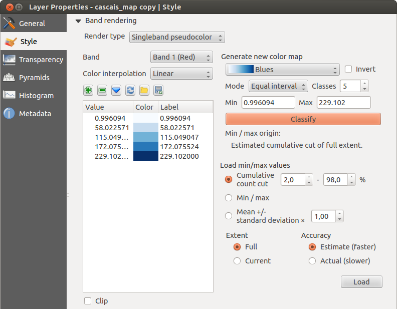
Banda Simples de Pseudocor - é possível a renderização de ficheiros com uma palete continua ou de cor (e.g., usada num mapa de altitude)
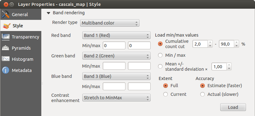
Cor multibanda
Com o renderizador da cor multibanda, as três bandas da imagem pode ser renderizada, pela banda que representa o componente vermelho, verde ou azul, que será usado para criar uma imagem colorida. Pode escolher vários: Contrast enhancement methods: ‘No enhancement’, ‘Stretch to MinMax’, ‘Stretch and clip to MinMax’ and ‘Clip to min max’.
Figure Raster 2:
Raster Renderer - Multiband color
This selection offers you a wide range of options to modify the appearance
of your raster layer. First of all, you have to get the data range from your
image. This can be done by choosing the Extent and pressing
[Load]. QGIS can  Estimate (faster) the
Min and Max values of the bands or use the
Estimate (faster) the
Min and Max values of the bands or use the
 Actual (slower) Accuracy.
Now you can scale the colors with the help of the Load min/max values section.
A lot of images have a few very low and high data. These outliers can be eliminated
using the Cumulative count cut setting. The standard data range is set
from 2% to 98% of the data values and can be adapted manually. With this
setting, the gray character of the image can disappear.
With the scaling option Min/max, QGIS creates a color table with all of
the data included in the original image (e.g., QGIS creates a color table
with 256 values, given the fact that you have 8 bit bands).
You can also calculate your color table using the Mean +/- standard deviation x  .
Then, only the values within the standard deviation or within multiple standard deviations
are considered for the color table. This is useful when you have one or two cells
with abnormally high values in a raster grid that are having a negative impact on
the rendering of the raster.
.
Then, only the values within the standard deviation or within multiple standard deviations
are considered for the color table. This is useful when you have one or two cells
with abnormally high values in a raster grid that are having a negative impact on
the rendering of the raster.
All calculations can also be made for the Current extent.
Tip
Visualização de uma Banda Simples de um Raster Multibanda
Se quiser ver uma única banda de uma imagem multibanda (por exemplo, vermelho), pode pensar que iria definir o verde e faixas azuis para “Not Set”. Mas esta não é a maneira correta. Para apresentar a banda vermelha, defina o tipo de imagem para ‘Banda simples cinza’, em seguida, selecione vermelha como a banda para usar a Cinza.
Paletizada
This is the standard render option for singleband files that already include a color table, where each pixel value is assigned to a certain color. In that case, the palette is rendered automatically. If you want to change colors assigned to certain values, just double-click on the color and the Select color dialog appears. Also, in QGIS 2.2. it’s now possible to assign a label to the color values. The label appears in the legend of the raster layer then.
Figure Raster 3:
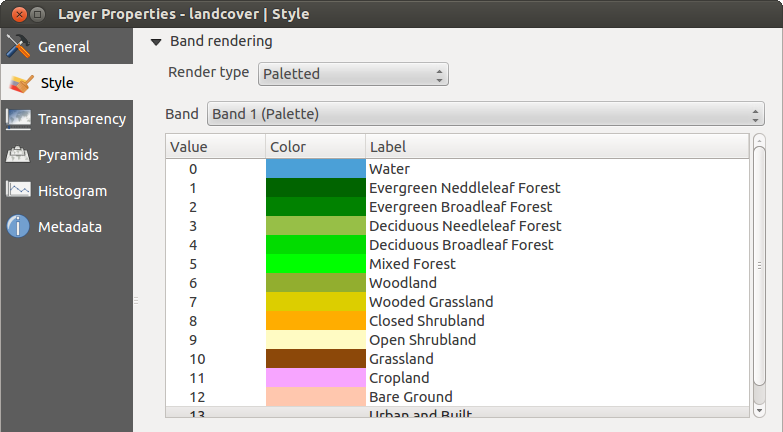
Raster Renderer - Paletted
Melhorar contraste
Note
When adding GRASS rasters, the option Contrast enhancement will always be set automatically to stretch to min max, regardless of if this is set to another value in the QGIS general options.
Banda cinza simples
This renderer allows you to render a single band layer with a Color gradient:
‘Black to white’ or ‘White to black’. You can define a Min
and a Max value by choosing the Extent first and
then pressing [Load]. QGIS can Estimate (faster) the
Min and Max values of the bands or use the
Actual (slower) Accuracy.
Figure Raster 4:
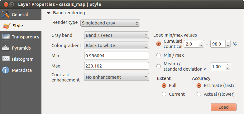
Raster Renderer - Singleband gray
With the Load min/max values section, scaling of the color table
is possible. Outliers can be eliminated using the Cumulative count cut setting.
The standard data range is set from 2% to 98% of the data values and can
be adapted manually. With this setting, the gray character of the image can disappear.
Further settings can be made with Min/max and
Mean +/- standard deviation x .
While the first one creates a color table with all of the data included in the
original image, the second creates a color table that only considers values
within the standard deviation or within multiple standard deviations.
This is useful when you have one or two cells with abnormally high values in
a raster grid that are having a negative impact on the rendering of the raster.
Banda de cor falsa simples
This is a render option for single-band files, including a continous palette. You can also create individual color maps for the single bands here.
Figure Raster 5:
Raster Renderer - Singleband pseudocolor
Três tipos de interpolação de cores estão disponíveis:
Discreto
- Linear
Exacto
In the left block, the button  Add values manually adds a value to the
individual color table. The button
Add values manually adds a value to the
individual color table. The button  Remove selected row
deletes a value from the individual color table, and the
Remove selected row
deletes a value from the individual color table, and the
 Sort colormap items button sorts the color table according
to the pixel values in the value column. Double clicking on the value column lets
you insert a specific value. Double clicking on the color column opens the dialog
Change color, where you can select a color to apply on that value. Further,
you can also add labels for each color, but this value won’t be displayed when you use the identify
feature tool.
You can also click on the button
Sort colormap items button sorts the color table according
to the pixel values in the value column. Double clicking on the value column lets
you insert a specific value. Double clicking on the color column opens the dialog
Change color, where you can select a color to apply on that value. Further,
you can also add labels for each color, but this value won’t be displayed when you use the identify
feature tool.
You can also click on the button  Load color map from band,
which tries to load the table from the band (if it has any). And you can use the
buttons
Load color map from band,
which tries to load the table from the band (if it has any). And you can use the
buttons  Load color map from file or
  Export color map to file to load an existing color table or to save the
defined color table for other sessions.
Export color map to file to load an existing color table or to save the
defined color table for other sessions.
In the right block, Generate new color map allows you to create newly
categorized color maps. For the Classification mode  ‘Equal interval’,
you only need to select the number of classes
and press the button Classify. You can invert the colors
of the color map by clicking the
‘Equal interval’,
you only need to select the number of classes
and press the button Classify. You can invert the colors
of the color map by clicking the  Invert
checkbox. In the case of the Mode ‘Continous’, QGIS creates
classes automatically depending on the Min and Max.
Defining Min/Max values can be done with the help of the Load min/max values section.
A lot of images have a few very low and high data. These outliers can be eliminated
using the Cumulative count cut setting. The standard data range is set
from 2% to 98% of the data values and can be adapted manually. With this
setting, the gray character of the image can disappear.
With the scaling option Min/max, QGIS creates a color table with all of
the data included in the original image (e.g., QGIS creates a color table
with 256 values, given the fact that you have 8 bit bands).
You can also calculate your color table using the Mean +/- standard deviation x .
Then, only the values within the standard deviation or within multiple standard deviations
are considered for the color table.
Invert
checkbox. In the case of the Mode ‘Continous’, QGIS creates
classes automatically depending on the Min and Max.
Defining Min/Max values can be done with the help of the Load min/max values section.
A lot of images have a few very low and high data. These outliers can be eliminated
using the Cumulative count cut setting. The standard data range is set
from 2% to 98% of the data values and can be adapted manually. With this
setting, the gray character of the image can disappear.
With the scaling option Min/max, QGIS creates a color table with all of
the data included in the original image (e.g., QGIS creates a color table
with 256 values, given the fact that you have 8 bit bands).
You can also calculate your color table using the Mean +/- standard deviation x .
Then, only the values within the standard deviation or within multiple standard deviations
are considered for the color table.
Renderização Cor
For every Band rendering, a Color rendering is possible.
You can also achieve special rendering effects for your raster file(s) using one of the blending modes (see Janela das Propriedades da Camada Vectorial).
Further settings can be made in modifiying the Brightness, the Saturation and the Contrast. You can also use a Grayscale option, where you can choose between ‘By lightness’, ‘By luminosity’ and ‘By average’. For one hue in the color table, you can modify the ‘Strength’.
Reamostragem
The Resampling option makes its appearance when you zoom in and out of an image. Resampling modes can optimize the appearance of the map. They calculate a new gray value matrix through a geometric transformation.
Figure Raster 6:
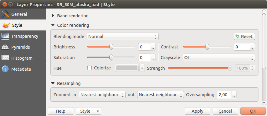
Raster Rendering - Resampling
When applying the ‘Nearest neighbour’ method, the map can have a pixelated structure when zooming in. This appearance can be improved by using the ‘Bilinear’ or ‘Cubic’ method, which cause sharp features to be blurred. The effect is a smoother image. This method can be applied, for instance, to digital topographic raster maps.
Menu Transparência
QGIS has the ability to display each raster layer at a different transparency level.
Use the transparency slider  to indicate to what extent the underlying layers
(if any) should be visible though the current raster layer. This is very useful
if you like to overlay more than one raster layer (e.g., a shaded relief map
overlayed by a classified raster map). This will make the look of the map more
three dimensional.
to indicate to what extent the underlying layers
(if any) should be visible though the current raster layer. This is very useful
if you like to overlay more than one raster layer (e.g., a shaded relief map
overlayed by a classified raster map). This will make the look of the map more
three dimensional.
Additionally, you can enter a raster value that should be treated as NODATA in the Additional no data value menu.
Uma forma ainda mais flexível para personalizar a transparência pode ser feito no: guilabel: seção de opções de transparência personalizado. A transparência de cada pixel pode ser definido aqui.
As an example, we want to set the water of our example raster file landcover.tif to a transparency of 20%. The following steps are neccessary:
Carregar o ficheiro raster:ficheiro:landcover.tif.
- Open the Properties dialog by double-clicking on the raster name in the legend, or by right-clicking and choosing Properties from the pop-up menu.
Seleccionar Transparência menu
No menu Transparencia da banda, escolha ‘Nenhum’.
- Click the Add values manually
button. A new row will appear in the pixel list.
Entre o valor dos raster na coluna ‘De’ e ‘Para’ (usamos 0 aqui), e ajuste a transparência a 20%.
Pressione no botão [Aplicar] e olhe para o mapa
Pode repetir os passos 5 e 6 para ajustar mais valores com a transparência personalizada.
As you can see, it is quite easy to set custom transparency, but it can be
quite a lot of work. Therefore, you can use the button  Export to file to save your transparency list to a file. The button
Import from file loads your transparency settings and
applies them to the current raster layer.
Export to file to save your transparency list to a file. The button
Import from file loads your transparency settings and
applies them to the current raster layer.
Menu Pirâmides
Large resolution raster layers can slow navigation in QGIS. By creating lower resolution copies of the data (pyramids), performance can be considerably improved, as QGIS selects the most suitable resolution to use depending on the level of zoom.
Deverá ter acesso à edição no directório onde os dados originais são armazenados para construir pirâmides.
Podem ser usados vários métodos de re-amostragem para calcular as pirâmides:
Vizinho mais próximo
Média
- Gauss
Cúbico
moda
Nenhum
If you choose ‘Internal (if possible)’ from the Overview format menu, QGIS tries to build pyramids internally. You can also choose ‘External’ and ‘External (Erdas Imagine)’.
Figure Raster 7:
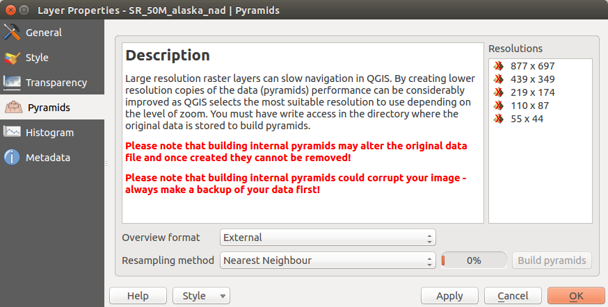
The Pyramids Menu
Note que o cálculo de peirâmides pode modificar o arquivo original de dados, e uma vez criado, não pode ser apagado. Se desejar preservar uma versão ‘sem pirâmides’ do seu raster, faça uma cópia de segurança antes do cálculo das mesmas.
Menu Histograma
The Histogram menu allows you to view the distribution of the bands
or colors in your raster. The histogram is generated automatically when you open the
Histogram menu. All existing bands will be displayed together. You can
save the histogram as an image with the button.
With the Visibility option in the  Prefs/Actions menu,
you can display histograms of the individual bands. You will need to select the option
Show selected band.
The Min/max options allow you to ‘Always show min/max markers’, to ‘Zoom
to min/max’ and to ‘Update style to min/max’.
With the Actions option, you can ‘Reset’ and ‘Recompute histogram’ after
you have chosen the Min/max options.
Prefs/Actions menu,
you can display histograms of the individual bands. You will need to select the option
Show selected band.
The Min/max options allow you to ‘Always show min/max markers’, to ‘Zoom
to min/max’ and to ‘Update style to min/max’.
With the Actions option, you can ‘Reset’ and ‘Recompute histogram’ after
you have chosen the Min/max options.
Figure Raster 8:
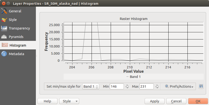
Raster Histogram
Menu Metadados
The Metadata menu displays a wealth of information about the raster layer, including statistics about each band in the current raster layer. From this menu, entries may be made for the Description, Attribution, MetadataUrl and Properties. In Properties, statistics are gathered on a ‘need to know’ basis, so it may well be that a given layer’s statistics have not yet been collected.
Figure Raster 9:
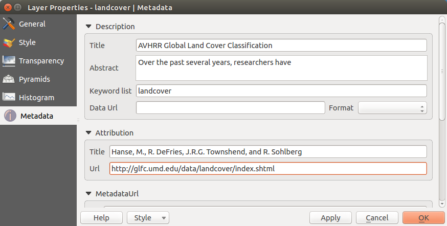
Raster Metadata