.
ヒートマッププラグイン
The Heatmap plugin uses Kernel Density Estimation to create a density (heatmap) raster of an input point vector layer. The density is calculated based on the number of points in a location, with larger numbers of clustered points resulting in larger values. Heatmaps allow easy identification of “hotspots” and clustering of points.
ヒートマッププラグインの有効化
このコアプラグインはプラグインマネージャ ( load_core_plugin のセクションを参照)を使って有効にする必要があります。それからヒートマップアイコン|heatmap| が有効になったこと、:menuselection:`ラスタ –> ヒートマップ`メニュー をラスタツールバーで確認できます。
ラスタツールバーが表示されない場合は 表示 ‣ ツールバー ‣ ラスタ を選択してツールバーを表示しましょう。
ヒートマッププラグインの利用
 `ヒートマップ`ツールボタンをクリックし、ヒートマッププラグインダイアログ (figure_heatmap_2 を参照)を開きます。
ダイアログには次のオプションがあります:
入力ポイントレイヤ: カレントプロジェクト内の すべてのベクタポイントレイヤのリストであり、選択したレイヤが分析に使われます。
- Output raster: Allows you to use the
 button to select the folder and
filename for the output raster the Heatmap plugin generates. A file extension
is not required.
button to select the folder and
filename for the output raster the Heatmap plugin generates. A file extension
is not required. - Output format: Selects the output format. Although all formats supported by GDAL can be choosen, in most cases GeoTIFF is the best format to choose.
- Radius: Is used to specify the heatmap search radius (or kernel bandwidth) in meters or map units. The radius specifies the distance around a point at which the influence of the point will be felt. Larger values result in greater smoothing, but smaller values may show finer details and variation in point density.
When the  Advanced checkbox is checked, additional options
will be available:
Advanced checkbox is checked, additional options
will be available:
- Rows and Columns: Used to change the dimensions of the output raster. These values are also linked to the Cell size X and Cell size Y values. Increasing the number of rows or columns will decrease the cell size and increase the file size of the output file. The values in Rows and Columns are also linked, so doubling the number of rows will automatically double the number of columns and the cell sizes will also be halved. The geographical area of the output raster will remain the same!
- Cell size X and Cell size Y: Control the geographic size of each pixel in the output raster. Changing these values will also change the number of Rows and Columns in the output raster.
- Kernel shape: The kernel shape controls the rate at which the influence of a point decreases as the distance from the point increases. Different kernels decay at different rates, so a triweight kernel gives features greater weight for distances closer to the point then the Epanechnikov kernel does. Consequently, triweight results in “sharper” hotspots, and Epanechnikov results in “smoother” hotspots. A number of standard kernel functions are available in QGIS, which are described and illustrated on Wikipedia.
- Decay ratio: Can be used with Triangular kernels to further control how heat from
a feature decreases with distance from the feature.
- A value of 0 (=minimum) indicates that the heat will be concentrated in the centre of the given radius and completely extinguished at the edge.
0.5の値は、半径の端のピクセルは、検索半径の中心にピクセルとして半分のヒートを与えられることを示しています。
1の値は、ヒートが探索半径の円全体上に均等に分散されていることを示します。 (これは「画一的な」カーネルに相当します)
1より大きい値は、ヒートが中央部よりも検索範囲のエッジに対して高いことを示している。
入力ポイントレイヤはヒートマップにどれくらい影響をおよぼすかの属性フィールドを持ちえます。
フィールドから半径を使用する:入力レイヤの属性フィールドから、各フィーチャの検索半径を設定します。
- Use weight from field: Allows input features to be weighted by an attribute field. This can be used to increase the influence certain features have on the resultant heatmap.
出力ラスタファイル名を指定したら、[OK] ボタンが利用でき、ヒートマップを作成します。
チュートリアル:ヒートマップの作成
For the following example, we will use the airports vector point layer from the QGIS sample dataset (see サンプルデータ). Another exellent QGIS tutorial on making heatmaps can be found at http://qgis.spatialthoughts.com.
Figure_Heatmap_1 ではアラスカの空港が示されてます。
Figure Heatmap 1:
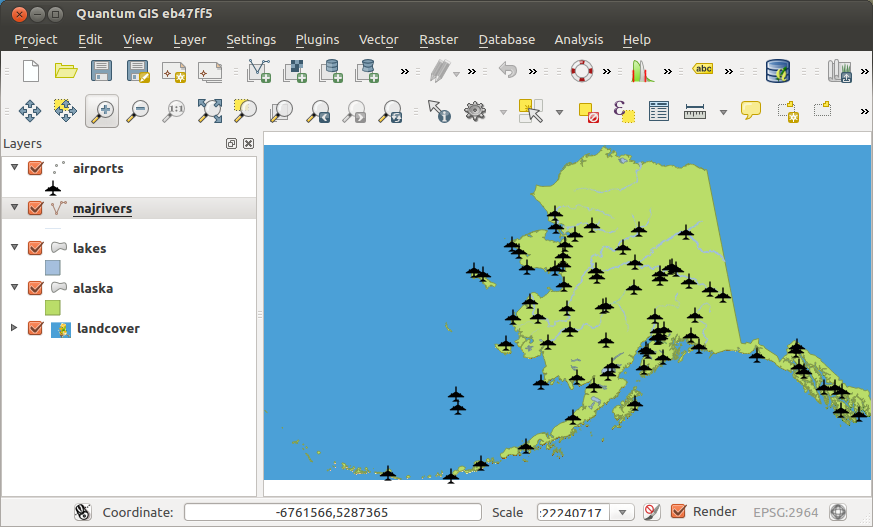
Airports of Alaska 
- Heatmap ツールボタンを選択しヒートマップダイアログ(Figure_Heatmap_2 を参照) を開きます。
- In the Input point layer
 field, select airports
from the list of point layers loaded in the current project.
field, select airports
from the list of point layers loaded in the current project. - Specify an output filename by clicking the button next to the
Output raster field. Enter the filename heatmap_airports (no
file extension is necessary).
出力フォーマット はデフォルトのフォーマットである``GeoTIFF``にしておきます。
半径 は 1000000 メートルに変更します。
[OK] をクリックし、空港のヒートマップを作成および読み込みます ( Figure_Heatmap_3 を参照)
Figure Heatmap 2:
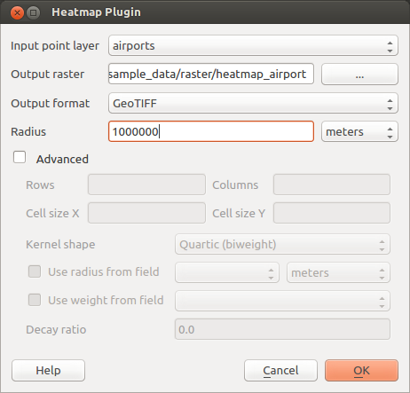
The Heatmap Dialog
QGIS will generate the heatmap and add the results to your map window. By default, the heatmap is shaded in greyscale, with lighter areas showing higher concentrations of airports. The heatmap can now be styled in QGIS to improve its appearance.
Figure Heatmap 3:
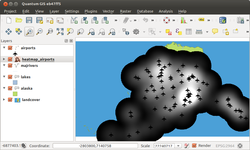
The heatmap after loading looks like a grey surface
` heatmap_airports``レイヤのプロパティダイアログを開きます(``heatmap_airports``レイヤを選択し、右ボタンでクリックしてコンテキストメニューを開き :guilabel:`プロパティ を選択します)
- Select the Style tab.
- Change the Render type to ‘Singleband pseudocolor’.
- Select a suitable Color map , for instance YlOrRed.
[読み込み] ボタンをクリックし、ラスタから最小および最大値を読み込み、**[分類]**ボタンをクリックします。
**[OK]**を押しレイヤを更新します。
最終的な結果は Figure_Heatmap_4 に示してあります。
Figure Heatmap 4:
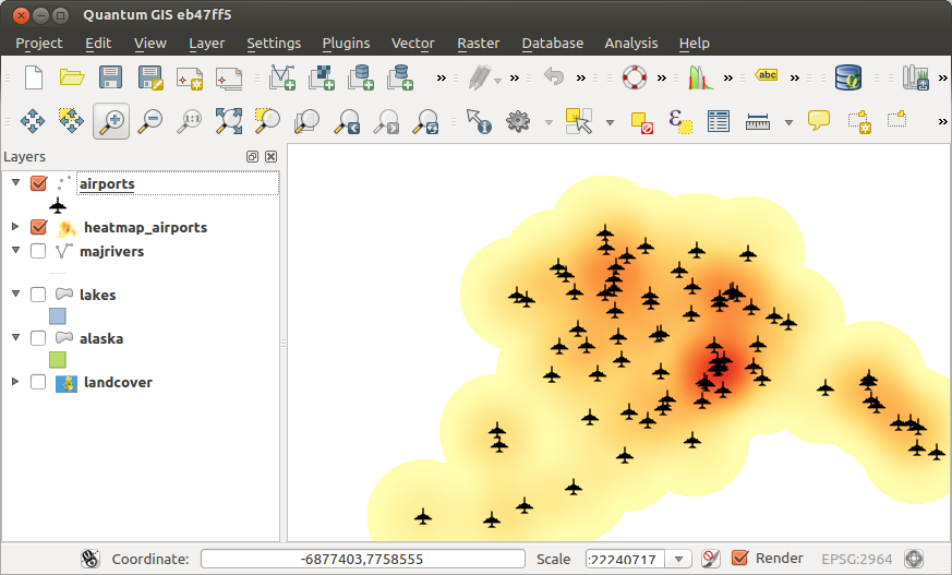
Styled heatmap of airports of Alaska