7.4. Lesson: 공간 통계
참고
이 강의는 Linfiniti와 S. Motala(남아프리카공화국 케이프 페닌슐라 기술대학교)가 작성했습니다.
공간 통계를 이용하면 주어진 벡터 데이터셋이 어떤 의미인지 분석하고 이해할 수 있습니다. QGIS는 이런 목적에 대해 유용하다고 알려진 몇몇 표준 통계 분석 도구를 포함하고 있습니다.
The goal for this lesson: To know how to use QGIS〉 spatial statistics tools within the Processing toolbox.
7.4.1.  Follow Along: 테스트용 데이터셋 생성
강의에서 사용할 포인트 데이터셋을 얻기 위해, 랜덤한 포인트들을 생성해보겠습니다.
이 때 포인트를 생성하려는 구역의 범위를 정의하는 폴리곤 데이터셋이 필요합니다.
거리들이 차지한 구역을 사용하겠습니다.
Start a new project.
Add your roads layer, as well as the srtm_41_19 raster file (elevation data) found in
exercise_data/raster/SRTM/.참고
You might find that your SRTM DEM layer has a different CRS to that of the roads layer. QGIS is reprojecting both layers in a single CRS. For the following exercises this difference does not matter, but feel free to reproject a layer in another CRS as shown in this module.
Open Processing toolbox.
Use the tool to generate an area enclosing all the roads by selecting
Convex Hullas the Geometry Type parameter: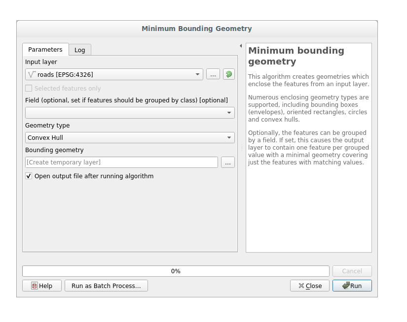
As you know, if you don’t specify the output, Processing creates temporary layers. It is up to you to save the layers immediately or in a second moment.
7.4.1.1. 랜덤한 포인트 생성
Create random points in this area using the tool at :
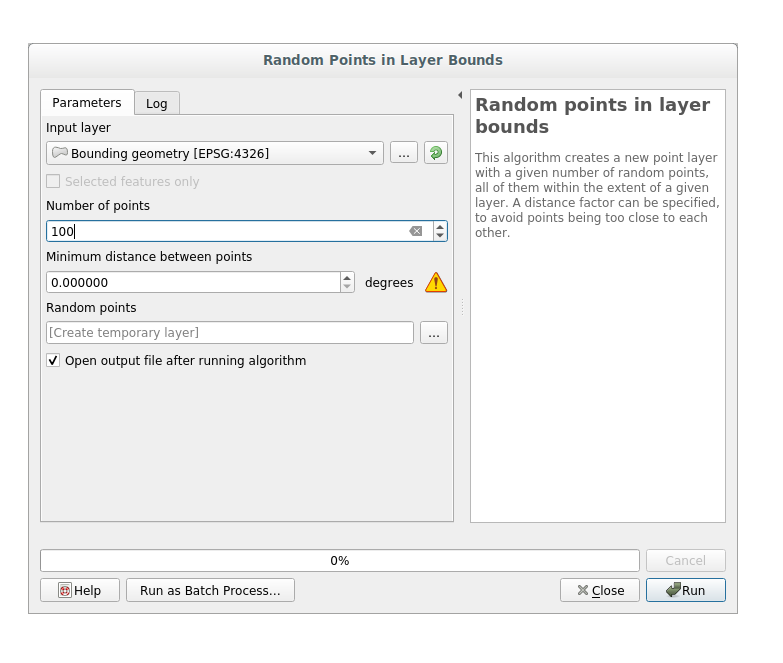
참고
The yellow warning sign is telling you that that parameter concerns something about the distance. The Bounding geometry layer is in a Geographical Coordinate System and the algorithm is just reminding you this. For this example we won’t use this parameter so you can ignore it.
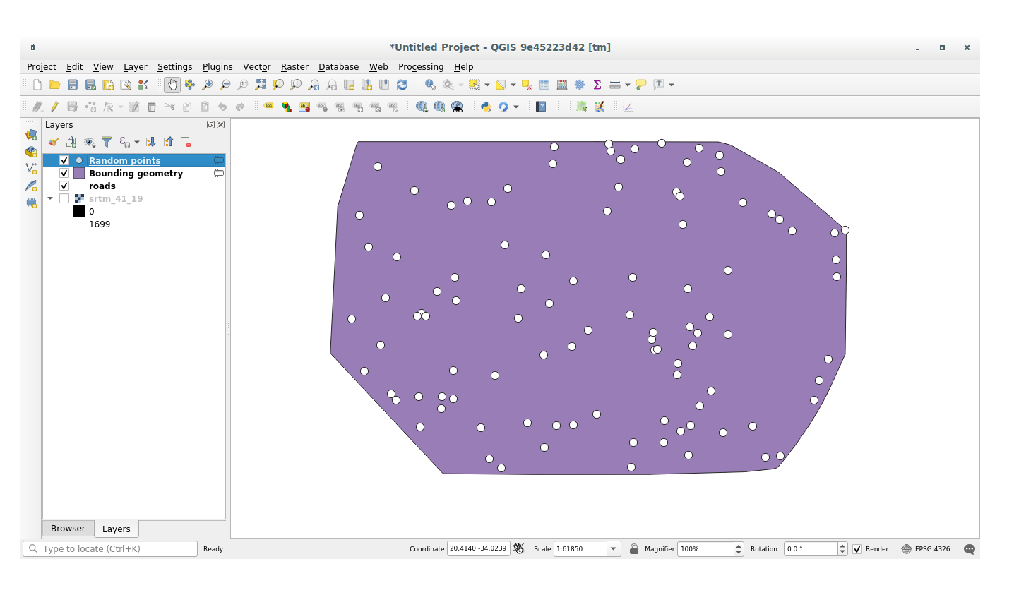
If needed, move the generated random point at the top of the legend to see them better:
7.4.1.2. 데이터 샘플링
To create a sample dataset from the raster, you’ll need to use the algorithm within Processing toolbox. This tool samples the raster at the points locations and copies the raster values in other field(s) depending on how many bands the raster is made of.
Open the Sample raster values algorithm dialog
Select random_points as the layer containing sampling points, and the SRTM raster as the band to get values from. The default name of the new field is
rvalue_N, whereNis the number of the raster band. You can change the name of the prefix if you want: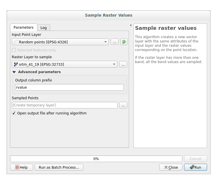
Press Run
Now you can check the sampled data from the raster file in the attributes table of the Random points layer, they will be in a new field with the name you have chosen.
다음과 비슷한 샘플 레이어가 보일 것입니다.
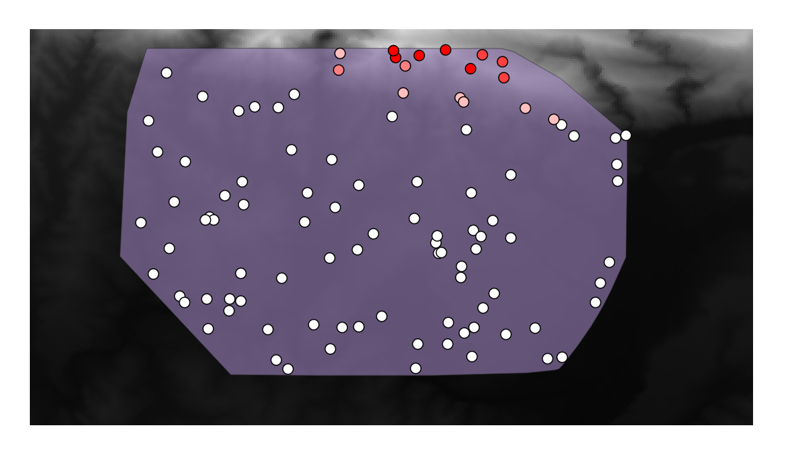
The sample points are classified by their rvalue_1 field such that red
points are at a higher altitude.
나머지 통계 실습 동안 이 샘플 레이어를 사용할 것입니다.
7.4.2. Follow Along: 기본 통계
이제 이 레이어에 대한 기본적인 통계를 내보겠습니다.
Click on the
 icon in the Attributes Toolbar of QGIS main dialog.
A new panel will pop up.
icon in the Attributes Toolbar of QGIS main dialog.
A new panel will pop up.In the dialog that appears, specify the Sampled Points layer as the source.
Select the rvalue_1 field in the field combo box which is the field you will calculate statistics for.
The Statistics Panel will be automatically updated with the calculated statistics:
참고
You can copy the values by clicking on the
 Copy Statistics To Clipboard
button and paste the results into a spreadsheet.
Copy Statistics To Clipboard
button and paste the results into a spreadsheet.Close the Statistics Panel when done.
Many different statistics are available, below some description:
- Count
샘플/값의 개수입니다.
- Sum
모든 값들을 더한 값입니다.
- Mean
중간(평균)값은 값을 모두 더한 것을 값의 개수로 나눈 값입니다.
- Median
모든 값을 최소에서 최대로 배열할 경우, 그 중앙에 있는 (또는 N이 짝수라면 두 중앙값의 평균) 값을 중앙값이라 합니다.
- St Dev (pop)
표준편차입니다. 값들이 얼마나 중간값에 가까이 모여 있는지를 나타냅니다. 표준편차가 작을수록 값들이 중간값에 더 가까이 모이는 경향이 있습니다.
- Minimum
최소값입니다.
- Maximum
최대값입니다.
- Range
최소/최대값의 차이입니다.
- Q1
First quartile of the data.
- Q3
Third quartile of the data.
- Missing (null) values
Total count of values with missing data-
7.4.3. Follow Along: Compute statistics on distances between points using the Distance Matrix tool
Create a new point layer as a
Temporary layer.Enter edit mode and digitize three points somewhere among the other points.
Alternatively, use the same random point generation method as before, but specify only three points.
Save your new layer as distance_points in the format you prefer.
To generate statistics on the distances between points in the two layers:
Open the tool .
Select the distance_points layer as the input layer, and the Sampled Points layer as the target layer.
다음과 같이 설정하십시오.
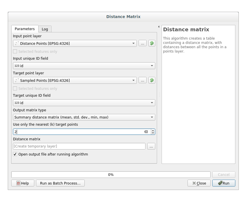
If you want you can save the output layer as a file or just run the algorithm and save the temporary output layer in a second moment.
Click Run to generate the distance matrix layer.
Open the attribute table of the generated layer: values refer to the distances between the distance_points features and their two nearest points in the Sampled Points layer:
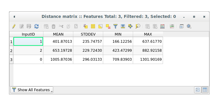
With these parameters, the Distance Matrix tool calculates distance
statistics for each point of the input layer with respect to the nearest points
of the target layer. The fields of the output layer contains the mean, standard
deviation, minimum and maximum for the distances to the nearest neighbors of the
points in the input layer.
7.4.4. Follow Along: Nearest Neighbor Analysis (within layer)
To do a nearest neighbor analysis of a point layer:
Click on the menu item .
In the dialog that appears, select the Random points layer and click Run.
The results will appear in the Processing Result Viewer Panel.
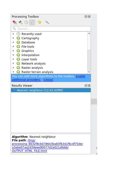
Click on the blue link to open the
htmlpage with the results: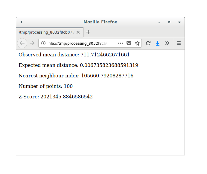
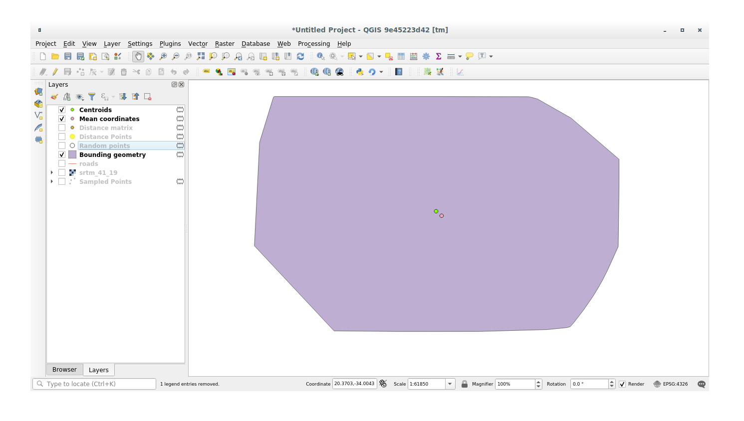
7.4.5. Follow Along: 평균 좌표
데이터의 평균 좌표를 얻으려면,
Click on the menu item.
In the dialog that appears, specify Random points as the input layer, but leave the optional choices unchanged.
Click Run.
이 레이어를 랜덤 샘플을 생성하는 데 쓰인 폴리곤의 중앙 좌표와 비교해봅시다.
Click on the menu item.
In the dialog that appears, select Bounding geometry as the input layer.
As you can see from the example below, the mean coordinates (pink point) and the center of the study area (in green) don’t necessarily coincide.
The centroid is the barycenter of the layer (the barycenter of a square is the center of the square) while the mean coordinates represent the average of all node coordinates.
7.4.6. Follow Along: 이미지 히스토그램
The histogram of a dataset shows the distribution of its values. The simplest way to demonstrate this in QGIS is via the image histogram, available in the Layer Properties dialog of any image layer (raster dataset).
In your Layers panel, right-click on the srtm_41_19 layer.
를 선택합니다.
Histogram 탭을 선택하십시오. 그래픽을 생성하려면 Compute Histogram 버튼을 클릭해야 할 수도 있습니다. 이미지 안의 값들의 빈도를 나타내는 그래프를 볼 수 있을 것입니다.
다음과 같이 그래프를 이미지로 내보낼 수 있습니다.
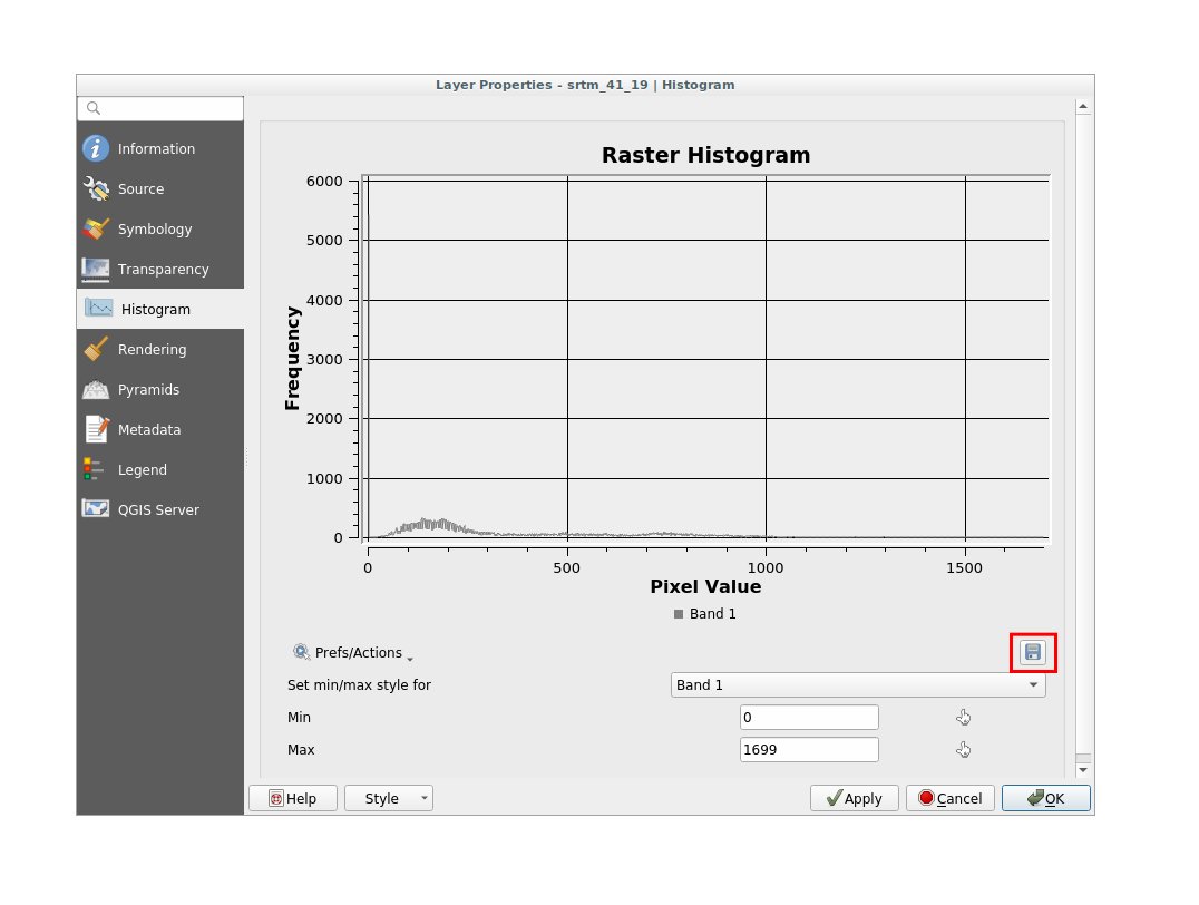
Select the Information tab, you can see more detailed information of the layer.
The mean value is 332.8, and the maximum value is 1699! But those
values don’t show up on the histogram. Why not? It’s because there are so few
of them, compared to the abundance of pixels with values below the mean. That’s
also why the histogram extends so far to the right, even though there is no
visible red line marking the frequency of values higher than about 250.
참고
If the mean and maximum values are not the same as those of the example,
it can be due to the min/max value calculation. Open the Symbology
tab and expand the Min / Max Value Settings menu. Choose
 Min / max and click on Apply.
따라서 히스토그램은 값들의 분포를 보여줄 뿐, 그래프 상에 모든 값을 보여주지 않을 수도 있다는 점을 기억해야 합니다.
7.4.7. Follow Along: 공간 보간법
Let’s say you have a collection of sample points from which you would like to extrapolate data. For example, you might have access to the Sampled points dataset we created earlier, and would like to have some idea of what the terrain looks like.
To start, launch the tool within Processing toolbox.
In the Point layer parameter, select Sampled points
Set
5.0as the Weighting powerIn the Advanced parameters set rvalue_1 for the Z value from field parameter
Finally click on Run and wait until the algorithm ends
Close the dialog
다음은 원래 데이터셋(왼쪽)과 샘플 포인트로부터 구축한 데이터셋(오른쪽)을 비교한 그림입니다. 사용자가 구축한 데이터셋은 샘플 포인트들의 위치의 랜덤성에 따라 달라 보일 수도 있습니다.
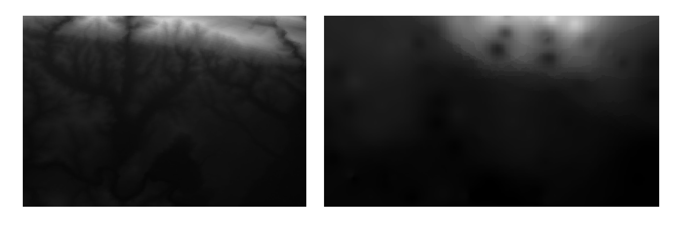
As you can see, 100 sample points aren’t really enough to get a detailed impression of the terrain. It gives a very general idea, but it can be misleading as well.
7.4.8.  Try Yourself Different interpolation methods
Use the processes shown above to create a new set of
10 000random points.참고
If the points amount is really big the processing time can take a long time.
이 포인트들을 이용해서 원 DEM을 샘플링하십시오.
Use the Grid (IDW with nearest neighbor searching) tool on this new dataset as above.
Set the Power and Smoothing to
5.0and2.0, respectively.
결과물은 (여러분의 랜덤 포인트 위치에 따라) 다음과 비슷하게 보일 것입니다.
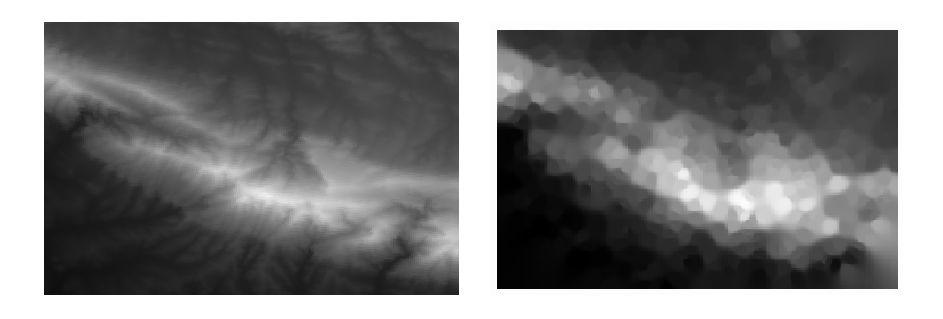
This is a much better representation of the terrain, due to the much greater density of sample points. Remember, bigger samples give better results.
7.4.9. In Conclusion
QGIS를 사용하면 데이터셋의 속성에 대해 다양한 공간 통계 분석을 할 수 있습니다.
7.4.10. What’s Next?
이제 벡터 분석에 대한 내용을 마쳤으니, 래스터에 대해 알아보는 것은 어떨까요? 이것이 다음 모듈의 주제입니다!