7.4. Lesson: Statistiques Spatiales
Note
Leçon développée par Linfiniti et S Motala (Cape Peninsula University of Technology)
Les statistiques spatiales vous permettent d’analyser et de comprendre ce qu’il se passe dans un jeu de données vectorielles. QGIS comprend plusieurs outils standards pour l’analyse statistique qui s’avèrent utiles à cet égard.
The goal for this lesson: To know how to use QGIS” spatial statistics tools within the Processing toolbox.
7.4.1.  Follow Along: Créer un jeu de données test
Afin de disposer d’un jeu de données de type point à utiliser, nous allons créer un jeu de points au hasard.
Pour ce faire, vous aurez besoin d’un jeu de données de type polygone qui définira l’étendue de la zone dans laquelle vous voulez créer les points.
Nous allons utiliser l’emprise couverte par les rues.
Start a new project.
Add your roads layer, as well as the srtm_41_19 raster file (elevation data) found in
exercise_data/raster/SRTM/.Note
You might find that your SRTM DEM layer has a different CRS to that of the roads layer. QGIS is reprojecting both layers in a single CRS. For the following exercises this difference does not matter, but feel free to reproject a layer in another CRS as shown in this module.
Open Processing toolbox.
Use the tool to generate an area enclosing all the roads by selecting
Convex Hullas the Geometry Type parameter: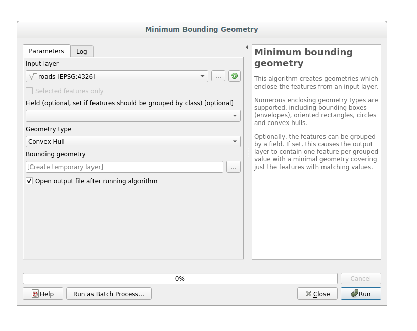
As you know, if you don’t specify the output, Processing creates temporary layers. It is up to you to save the layers immediately or in a second moment.
7.4.1.1. Création de points aléatoires
Create random points in this area using the tool at :
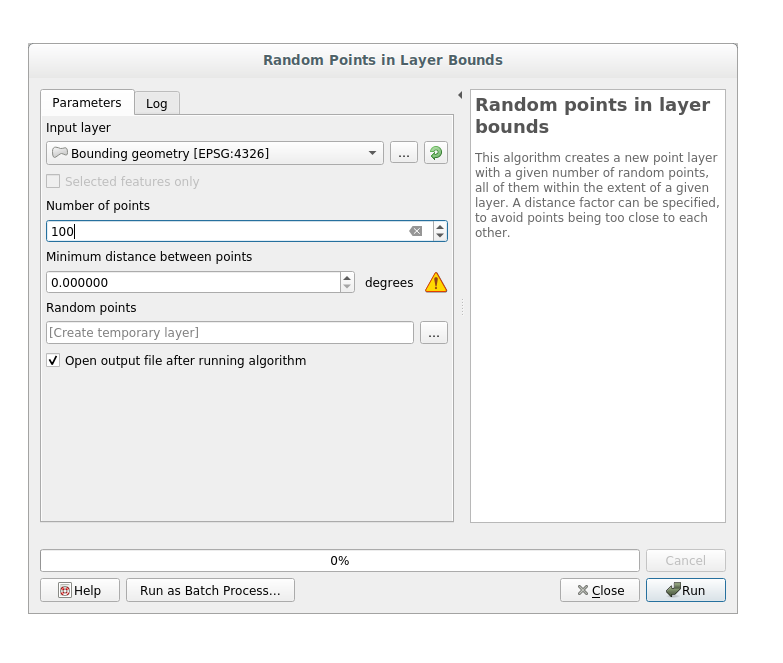
Note
The yellow warning sign is telling you that that parameter concerns something about the distance. The Bounding geometry layer is in a Geographical Coordinate System and the algorithm is just reminding you this. For this example we won’t use this parameter so you can ignore it.
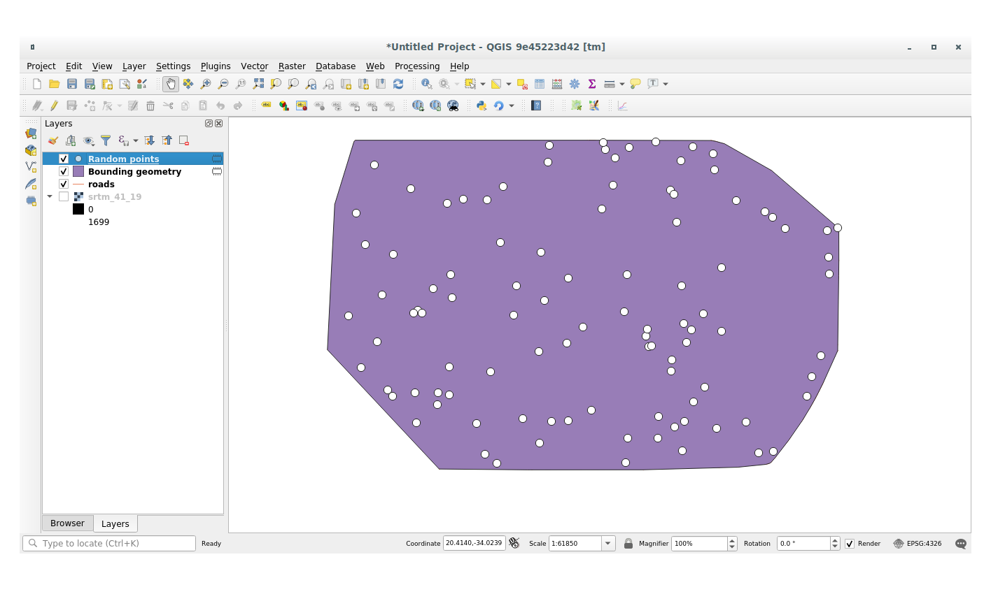
If needed, move the generated random point at the top of the legend to see them better:
7.4.1.2. Échantillonage des données
To create a sample dataset from the raster, you’ll need to use the algorithm within Processing toolbox. This tool samples the raster at the points locations and copies the raster values in other field(s) depending on how many bands the raster is made of.
Open the Sample raster values algorithm dialog
Select random_points as the layer containing sampling points, and the SRTM raster as the band to get values from. The default name of the new field is
rvalue_N, whereNis the number of the raster band. You can change the name of the prefix if you want: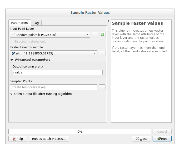
Press Run
Now you can check the sampled data from the raster file in the attributes table of the Random points layer, they will be in a new field with the name you have chosen.
Voici un exemple de représentation de la couche:
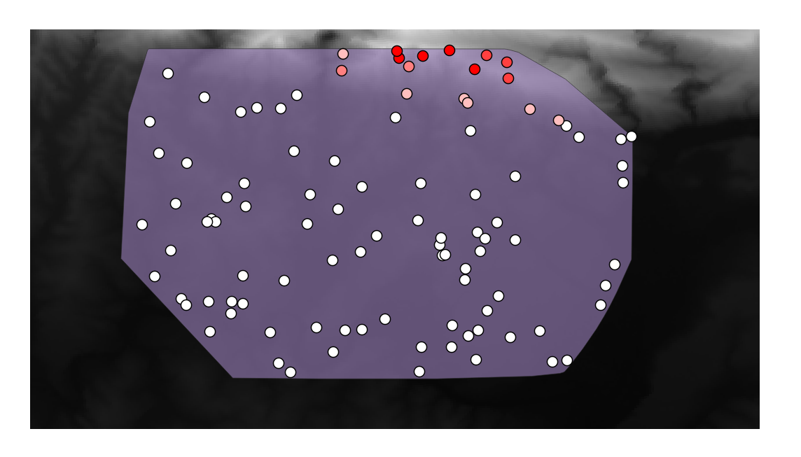
The sample points are classified by their rvalue_1 field such that red
points are at a higher altitude.
Vous allez utiliser cette couche d’échantillon pour le reste des exercices statistiques.
7.4.2. Follow Along: Statistiques Basiques
Maintenant, récupérez les statistiques basiques de cette couche.
Click on the
 icon in the Attributes Toolbar of QGIS main dialog.
A new panel will pop up.
icon in the Attributes Toolbar of QGIS main dialog.
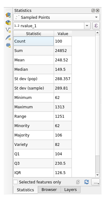
A new panel will pop up.In the dialog that appears, specify the Sampled Points layer as the source.
Select the rvalue_1 field in the field combo box which is the field you will calculate statistics for.
The Statistics Panel will be automatically updated with the calculated statistics:
Note
You can copy the values by clicking on the
 Copy Statistics To Clipboard
button and paste the results into a spreadsheet.
Copy Statistics To Clipboard
button and paste the results into a spreadsheet.Close the Statistics Panel when done.
Many different statistics are available, below some description:
- Count
Le nombre de données/valeurs.
- Somme
Toutes les valeurs ajoutées ensemble.
- Moyenne
La valeur moyenne est simplement la somme des valeurs divisée par le nombre de valeurs.
- Médiane
Si vous ordonnez les valeurs de la plus petite à la plus grande, la valeur du milieu (ou la moyenne des deux valeurs du milieu si N est un nombre pair) est la médiane des valeurs.
- St Dev (pop)
La déviation standard. Donne une indication sur la manière dont les valeurs sont regroupées autour de la moyenne. Plus la déviation est faible, plus les valeurs tendent à se situer à la moyenne.
- Minimum
La valeur minimale.
- Maximum
La valeur maximale.
- Portée
La différence entre les valeurs minimale et maximale.
- Q1
First quartile of the data.
- Q3
Third quartile of the data.
- Missing (null) values
Total count of values with missing data-
7.4.3. Follow Along: Compute statistics on distances between points using the Distance Matrix tool
Create a new point layer as a
Temporary layer.Enter edit mode and digitize three points somewhere among the other points.
Alternatively, use the same random point generation method as before, but specify only three points.
Save your new layer as distance_points in the format you prefer.
To generate statistics on the distances between points in the two layers:
Open the tool .
Select the distance_points layer as the input layer, and the Sampled Points layer as the target layer.
Définissez-le comme ceci:

If you want you can save the output layer as a file or just run the algorithm and save the temporary output layer in a second moment.
Click Run to generate the distance matrix layer.
Open the attribute table of the generated layer: values refer to the distances between the distance_points features and their two nearest points in the Sampled Points layer:
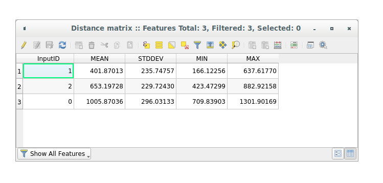
With these parameters, the Distance Matrix tool calculates distance
statistics for each point of the input layer with respect to the nearest points
of the target layer. The fields of the output layer contains the mean, standard
deviation, minimum and maximum for the distances to the nearest neighbors of the
points in the input layer.
7.4.4. Follow Along: Nearest Neighbor Analysis (within layer)
To do a nearest neighbor analysis of a point layer:
Click on the menu item .
In the dialog that appears, select the Random points layer and click Run.
The results will appear in the Processing Result Viewer Panel.
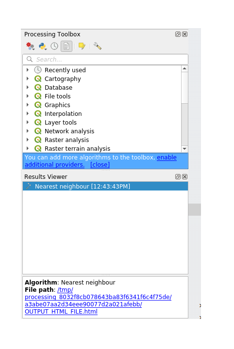
Click on the blue link to open the
htmlpage with the results: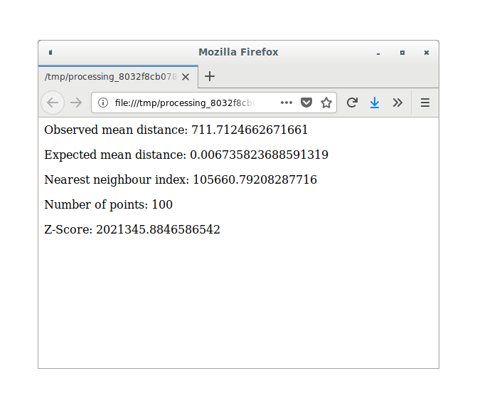
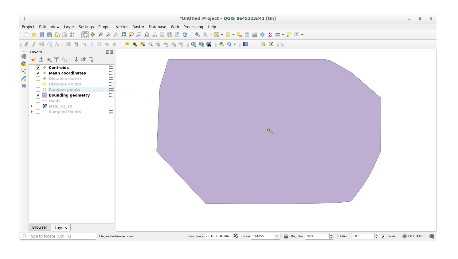
7.4.5. Follow Along: Coordonnées Moyennes
Pour obtenir les coordonnées moyennes d’un jeu de données:
Click on the menu item.
In the dialog that appears, specify Random points as the input layer, but leave the optional choices unchanged.
Click Run.
Comparons cela aux coordonnées centrales du polygone qui a été utilisé pour créer les données aléatoires.
Click on the menu item.
In the dialog that appears, select Bounding geometry as the input layer.
As you can see from the example below, the mean coordinates (pink point) and the center of the study area (in green) don’t necessarily coincide.
The centroid is the barycenter of the layer (the barycenter of a square is the center of the square) while the mean coordinates represent the average of all node coordinates.
7.4.6. Follow Along: Histogrammes d’image
The histogram of a dataset shows the distribution of its values. The simplest way to demonstrate this in QGIS is via the image histogram, available in the Layer Properties dialog of any image layer (raster dataset).
In your Layers panel, right-click on the srtm_41_19 layer.
Sélectionnez .
Choisissez l’onglet Histogramme. Vous devrez cliquer sur le bouton Calculer l’histogramme pour générer le graphique. Un graphe décrivant la fréquence des valeurs de l’image sera alors affiché.
Vous pouvez l’exporter en tant qu’image:

Select the Information tab, you can see more detailed information of the layer.
The mean value is 332.8, and the maximum value is 1699! But those
values don’t show up on the histogram. Why not? It’s because there are so few
of them, compared to the abundance of pixels with values below the mean. That’s
also why the histogram extends so far to the right, even though there is no
visible red line marking the frequency of values higher than about 250.
Note
If the mean and maximum values are not the same as those of the example,
it can be due to the min/max value calculation. Open the Symbology
tab and expand the Min / Max Value Settings menu. Choose
 Min / max and click on Apply.
Par conséquent, gardez en tête qu’un histogramme vous montre la distribution des valeurs, et toutes les valeurs ne sont pas forcément visibles sur le graphe.
7.4.7. Follow Along: Interpolation Spatiale
Let’s say you have a collection of sample points from which you would like to extrapolate data. For example, you might have access to the Sampled points dataset we created earlier, and would like to have some idea of what the terrain looks like.
To start, launch the tool within Processing toolbox.
In the Point layer parameter, select Sampled points
Set
5.0as the Weighting powerIn the Advanced parameters set rvalue_1 for the Z value from field parameter
Finally click on Run and wait until the algorithm ends
Close the dialog
Voici une comparaison entre le jeu de données originel (gauche) et celui construit à partir de nos points (droite). Les votres peuvent sembler différents étant donné la nature aléatoire de l’emplacement des points.
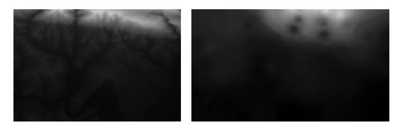
As you can see, 100 sample points aren’t really enough to get a detailed impression of the terrain. It gives a very general idea, but it can be misleading as well.
7.4.8.  Try Yourself Different interpolation methods
Use the processes shown above to create a new set of
10 000random points.Note
If the points amount is really big the processing time can take a long time.
Utilisez ces points pour échantilloner le MEN originel.
Use the Grid (IDW with nearest neighbor searching) tool on this new dataset as above.
Set the Power and Smoothing to
5.0and2.0, respectively.
Les résultats (dépendamment de la position de vos points aléatoires) ressembleront plus ou moins à cela :
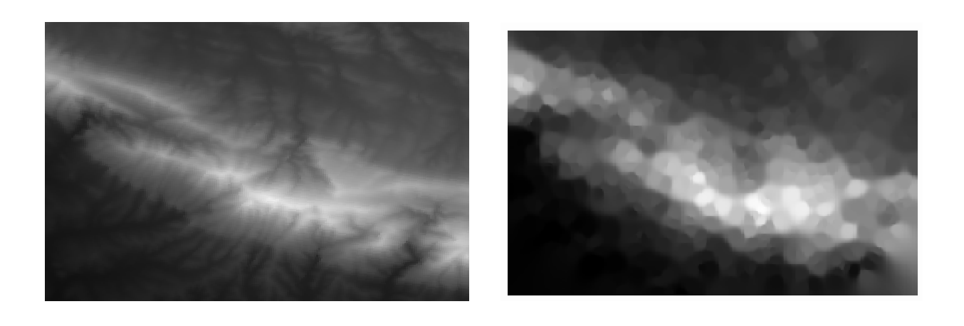
This is a much better representation of the terrain, due to the much greater density of sample points. Remember, bigger samples give better results.
7.4.9. In Conclusion
QGIS permet de nombreuses possibilités pour l’analyse des propriétés statistiques spatiales des jeu de données.
7.4.10. What’s Next?
Maintenant que nous avons couvert l’analyse vectorielle, pourquoi ne pas voir ce qu’il peut être fait avec des rasters ? C’est ce que nous ferons dans le prochain module !