4. Lesson: Statistiques Spatiales
Note
Leçon développée par Linfiniti et S Motala (Cape Peninsula University of Technology)
Spatial statistics allow you to analyze and understand what is going on in a given vector dataset. QGIS includes several standard tools for statistical analysis which prove useful in this regard.
L’objectif de cette leçon: Apprendre à utiliser les outils de statistiques spatiales dans QGIS.
4.1.  Follow Along: Créer un jeu de données test
Afin de disposer d’un jeu de données de type point à utiliser, nous allons créer un jeu de points au hasard.
Pour ce faire, vous aurez besoin d’un jeu de données de type polygone qui définira l’étendue de la zone dans laquelle vous voulez créer les points.
Nous allons utiliser l’emprise couverte par les rues.
Créer une nouvelle carte vide
Ajoutez la couche
roads_33Sdu dossierexercise_data/projected_data, ainsi que le raster (donnée d’élévation)srtm_41_19.tifqui se trouve dansexercise_data/raster/SRTM/.Utilisez l’outil Enveloppe(s) Convexe(s) (disponible dans Vecteur ‣ Outils de géotraitement) pour générer une zone englobant toutes les routes:
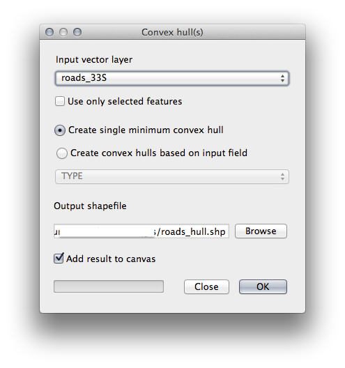
Enregistrez le fichier de sortie sous
roads_hull.shpdans le dossierexercise_data/spatial_statistics/.- Add it to the TOC (Layers list) when prompted.
4.1.1. Création de points aléatoires
Créer des points aléatoires dans cette zone à l’aide de l’outil Vecteur ‣ Outils de recherche ‣ Points aléatoires:
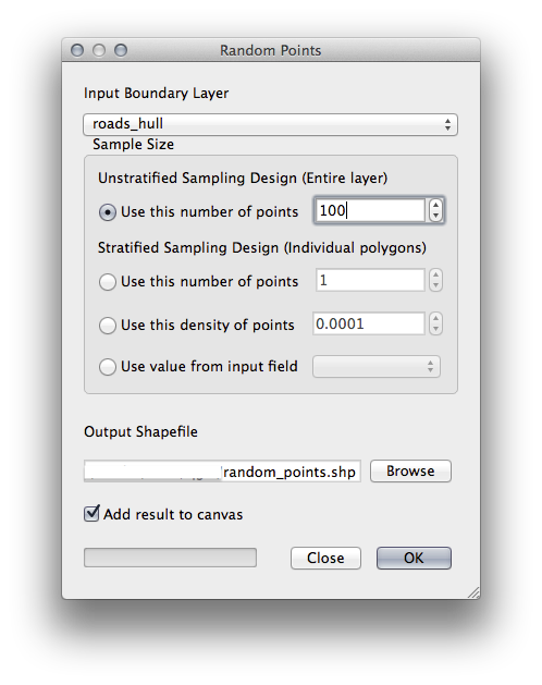
Enregistrez le fichier de sortie sous
random_points.shpdans le dossierexercise_data/spatial_statistics/.- Add it to the TOC (Layers list) when prompted:
4.1.2. Sampling the data
- To create a sample dataset from the raster, you’ll need to use the Point sampling tool plugin.
Si nécessaire, consultez auparavant le module sur les extensions.
Recherchez le texte
point samplingdans la fenêtre Extension –> Installer/Gérer les extensions... et vous trouverez l’extension.Une fois activé dans le Gestionnaire d’extensions, vous verrez apparaître l’outil sous Extension ‣ Analyses ‣ Point sampling tool:
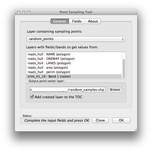
- Select random_points as the layer containing sampling points, and the SRTM raster as the band to get values from.
- Make sure that “Add created layer to the TOC” is checked.
Enregistrez le fichier de sortie sous
random_samples.shpdans le dossierexercise_data/spatial_statistics/.
Now you can check the sampled data from the raster file in the attributes
table of the random_samples layer, they will be in a column
named srtm_41_19.
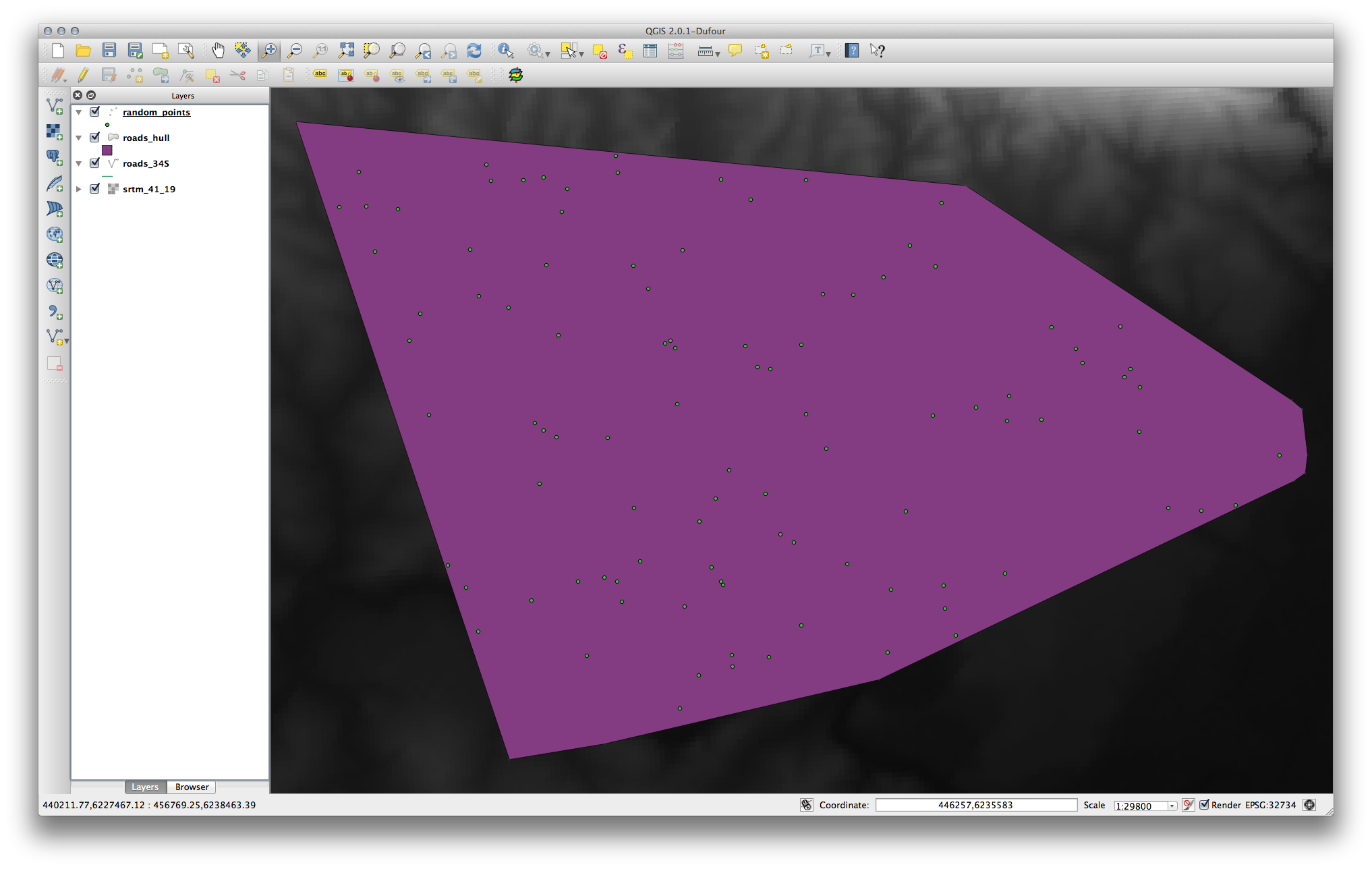
A possible sample layer is shown here:
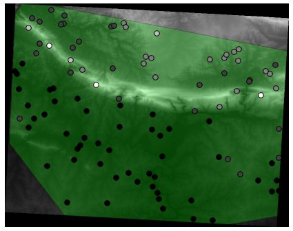
The sample points are classified by their value such that darker points are at a lower altitude.
You’ll be using this sample layer for the rest of the statistical exercises.
4.2. Follow Along: Statistiques Basiques
Maintenant, récupérez les statistiques basiques de cette couche.
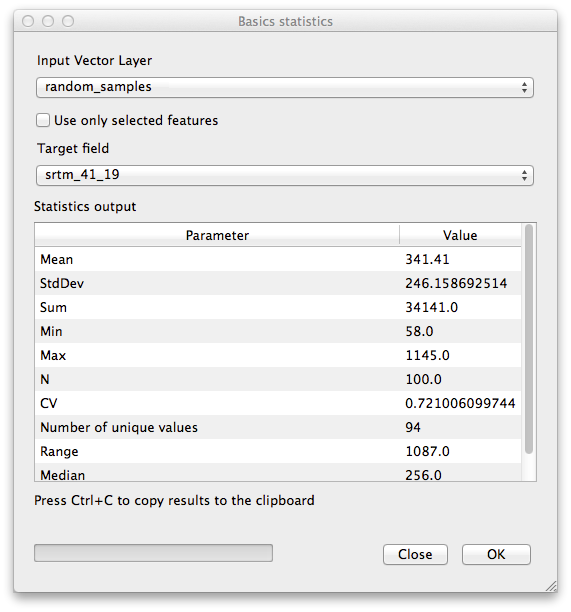
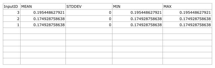
Cliquez sur l’entrée du menu Vecteur ‣ Outils d’analyse ‣ Statistiques basiques.
Dans la fenêtre qui apparaît, indiquez la couche random_samples comme couche en entrée.
assurez-vous que le Champ cible est défini à srtm_41_19, champ sur lequel seront calculées les statistiques.
Cliquez sur OK. Vous obtiendrez des résultats comme ceci:
Note
Vous pouvez copier et coller les résultats dans un tableur. La donnée utilise le séparateur deux-points (:).
Une fois fait, fermez la fenêtre de l’extension.
Pour comprendre les statistiques ci-dessus, référez-vous à la liste de définition:
- Moyenne
- The mean (average) value is simply the sum of the values divided by the amount of values.
- Écart-type
- The standard deviation. Gives an indication of how closely the values are clustered around the mean. The smaller the standard deviation, the closer values tend to be to the mean.
- Somme
Toutes les valeurs ajoutées ensemble.
- Min
La valeur minimale.
- Max
La valeur maximale.
- N
- The amount of samples/values.
- CV
La covariance spatiale du jeu de données.
- Nombre de valeurs uniques
Le nombre de valeurs uniques dans l’ensemble du jeu de données. S’il y a 90 valeurs uniques dans un jeu de données ayant N=100, alors les 10 valeurs restantes sont identiques à une ou plusieurs d’entre elles.
- Portée
La différence entre les valeurs minimale et maximale.
- Médiane
- If you arrange all the values from least to greatest, the middle value (or the average of the two middle values, if N is an even number) is the median of the values.
4.3. Follow Along: Calculer une Matrice des Distances
Créez une nouvelle couche de point dans la même projection que les autres jeux de données (
WGS 84 / UTM 33S).Passez en mode Édition et numérisez trois points quelque part au milieu des autres points.
- Alternatively, use the same random point generation method as before, but specify only three points.
Sauvegardez votre nouvelle couche sous
distance_points.shp.
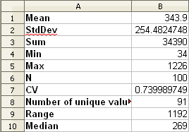
Pour générer une matrice des distances utilisant ces points:
Ouvrez l’outil Vecteur ‣ Outils d’analyse ‣ Matrice des distances.
- Select the distance_points layer as the input layer, and the random_samples layer as the target layer.
Définissez-le comme ceci:
Sauvegardez le résultat sous
distance_matrix.csv.Cliquez sur OK pour générer la matrice des distances.
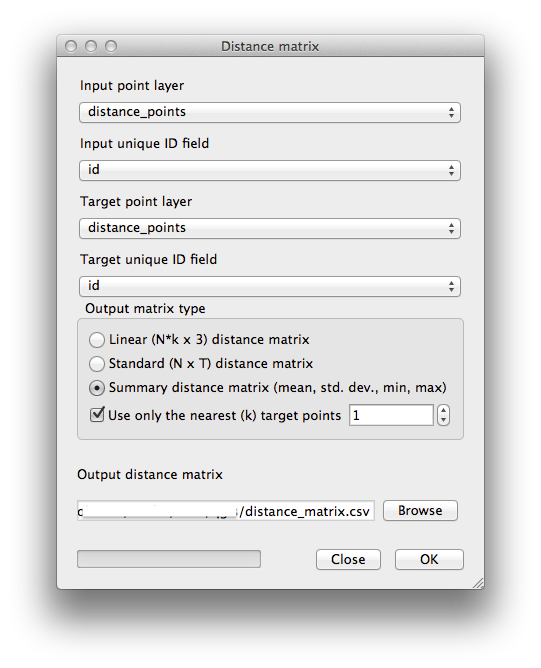
Ouvrez-le dans un tableur pour voir les résultats. Voici un exemple:
4.4. Follow Along: Analyse du Plus Proche Voisin
Pour faire une analyse du plus proche voisin:
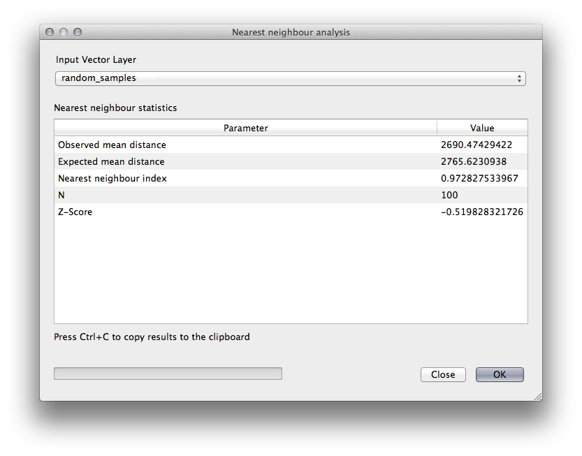
Cliquez sur l’entrée du menu Vecteur ‣ Outils d’analyse ‣ Analyse du plus proche voisin.
Dans la fenêtre qui apparaît, sélectionnez la couche random_samples et cliquez sur OK.
Les résultats apparaîtront dans la boîte de dialogue de la fenêtre, comme sur l’exemple:
Note
Vous pouvez copier et coller les résultats dans un tableur. La donnée utilise le séparateur deux-points (:).
4.5. Follow Along: Coordonnées Moyennes
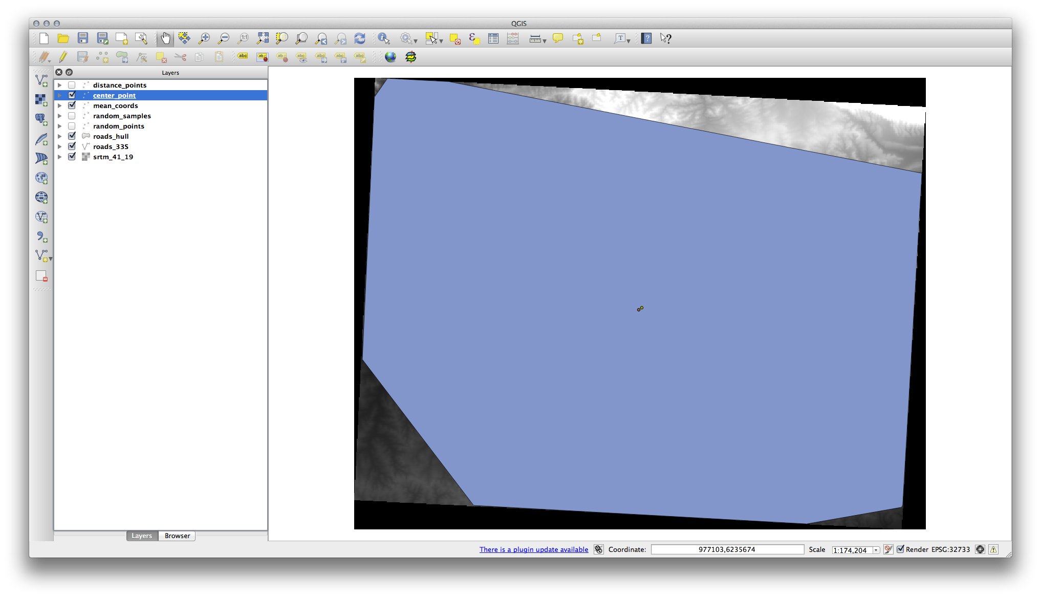
Pour obtenir les coordonnées moyennes d’un jeu de données:
Cliquez sur l’entrée du menu Vecteur ‣ Outils d’analyse ‣ Cordonnée(s) moyenne(s)
Dans la fenêtre qui apparaît, indiquez la couche random_samples comme couche en entrée, mais laissez inchangées les autres options.
- Specify the output layer as
mean_coords.shp. Cliquez sur OK.
- Add the layer to the Layers list when prompted.
Let’s compare this to the central coordinate of the polygon that was used to create the random sample.
Cliquez sur l’élément du menu Vecteur ‣ Outils de géométrie ‣ Centroïdes de polygones
Dans la fenêtre qui apparaît, indiquez la couche roads_hull comme couche en entrée.
Sauvegardez le résultat sous
center_point.- Add it to the Layers list when prompted.
Comme vous pouvez le voir dans l’exemple ci-dessous, les coordonnées moyennes et le centroïde de la zone d’étude (en orange) ne coïncident pas nécessairement:
4.6. Follow Along: Image Histograms
The histogram of a dataset shows the distribution of its values. The simplest way to demonstrate this in QGIS is via the image histogram, available in the Layer Properties dialog of any image layer.
- In your Layers list, right-click on the SRTM DEM layer.
Sélectionnez Propriétés.
- Choose the tab Histogram. You may need to click on the Compute Histogram button to generate the graphic. You will see a graph describing the frequency of values in the image.
Vous pouvez l’exporter en tant qu’image:
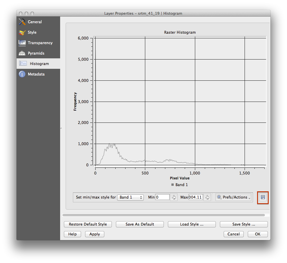
- Select the Metadata tab, you can see more detailed information inside the Properties box.
The mean value is 332.8, and the maximum value is 1699! But those
values don’t show up on the histogram. Why not? It’s because there are so few
of them, compared to the abundance of pixels with values below the mean. That’s
also why the histogram extends so far to the right, even though there is no
visible red line marking the frequency of values higher than about 250.
Therefore, keep in mind that a histogram shows you the distribution of values, and not all values are necessarily visible on the graph.
(Vous pouvez maintenant fermer la fenêtre Propriétés de la couche.)
4.7. Follow Along: Interpolation Spatiale
Let’s say you have a collection of sample points from which you would like to extrapolate data. For example, you might have access to the random_samples dataset we created earlier, and would like to have some idea of what the terrain looks like.
To start, launch the Grid (Interpolation) tool by clicking on the Raster ‣ Analysis ‣ Grid (Interpolation) menu item.
- In the Input file field, select
random_samples. - Check the Z Field box, and select the field
srtm_41_19. - Set the Output file location to
exercise_data/spatial_statistics/interpolation.tif. - Check the Algorithm box and select Inverse distance to a power.
- Set the Power to
5.0and the Smoothing to2.0. Leave the other values as-is. - Check the Load into canvas when finished box and click OK.
- When it’s done, click OK on the dialog that says
Process
completed
, click OK on the dialog showing feedback information (if it has appeared), and click Close on the Grid (Interpolation) dialog.
Here’s a comparison of the original dataset (left) to the one constructed from our sample points (right). Yours may look different due to the random nature of the location of the sample points.
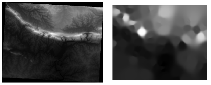
As you can see, 100 sample points aren’t really enough to get a detailed impression of the terrain. It gives a very general idea, but it can be misleading as well. For example, in the image above, it is not clear that there is a high, unbroken mountain running from east to west; rather, the image seems to show a valley, with high peaks to the west. Just using visual inspection, we can see that the sample dataset is not representative of the terrain.
4.8.  Try Yourself
- Use the processes shown above to create a new set of
1000random points. - Use these points to sample the original DEM.
- Use the Grid (Interpolation) tool on this new dataset as above.
- Set the output filename to
interpolation_1000.tif, with Power and Smoothing set to5.0and2.0, respectively.
The results (depending on the positioning of your random points) will look more or less like this:
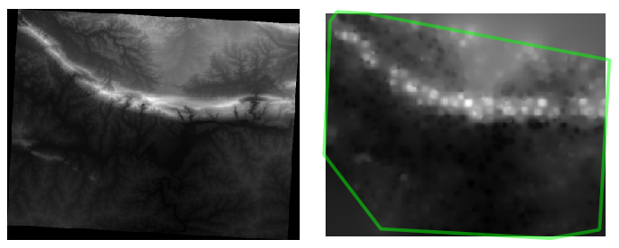
The border shows the roads_hull layer (which represents the boundary of the random sample points) to explain the sudden lack of detail beyond its edges. This is a much better representation of the terrain, due to the much greater density of sample points.
Here is an example of what it looks like with 10 000 sample points:
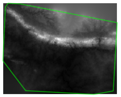
Note
It’s not recommended that you try doing this with 10 000 sample points if you are not working on a fast computer, as the size of the sample dataset requires a lot of processing time.
4.9. Follow Along: Outils complémentaires d’analyse spatiale
Originally a separate project and then accessible as a plugin, the SEXTANTE software has been added to QGIS as a core function from version 2.0. You can find it as a new QGIS menu with its new name Processing from where you can access a rich toolbox of spatial analysis tools allows you to access various plugin tools from within a single interface.
- Activate this set of tools by enabling the Processing ‣ Toolbox
menu entry. The toolbox looks like this:
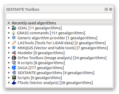
You will probably see it docked in QGIS to the right of the map. Note that the tools listed here are links to the actual tools. Some of them are SEXTANTE’s own algorithms and others are links to tools that are accessed from external applications such as GRASS, SAGA or the Orfeo Toolbox. This external applications are installed with QGIS so you are already able to make use of them. In case you need to change the configuration of the Processing tools or, for example, you need to update to a new version of one of the external applications, you can access its setting from Processing ‣ Options and configurations.
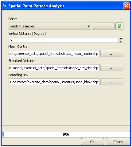
4.10. Follow Along: Spatial Point Pattern Analysis
For a simple indication of the spatial distribution of points in the random_samples dataset, we can make use of SAGA’s Spatial Point Pattern Analysis tool via the Processing Toolbox you just opened.
- In the Processing Toolbox, search for this tool Spatial Point Pattern Analysis.
- Double-click on it to open its dialog.
4.10.1. Installing SAGA
Note
If SAGA is not installed on your system, the plugin’s dialog will inform you that the dependency is missing. If this is not the case, you can skip these steps.
4.10.2. Sur Windows
Included in your course materials you will find the SAGA installer for Windows.
- Start the program and follow its instructions to install SAGA on your Windows system. Take note of the path you are installing it under!
Once you have installed SAGA, you’ll need to configure SEXTANTE to find the path it was installed under.
- Click on the menu entry Analysis ‣ SAGA options and configuration.
- In the dialog that appears, expand the SAGA item and look for SAGA folder. Its value will be blank.
- In this space, insert the path where you installed SAGA.
4.10.3. sur Ubuntu:
- Search for SAGA GIS in the Software Center, or enter
the phrase
sudo apt-get install saga-gisin your terminal. (You may first need to add a SAGA repository to your sources.) - QGIS will find SAGA automatically, although you may need to restart QGIS if it doesn’t work straight away.
4.10.4. Sur Mac
Les utilisateurs de Homebrew peuvent installer SAGA avec cette commande:
- brew install saga-core
Si vous n’utilisez pas Homebrew, veuillez suivre les instructions ici:
http://sourceforge.net/apps/trac/saga-gis/wiki/Compiling%20SAGA%20on%20Mac%20OS%20X
4.10.5. After installing
Now that you have installed and configured SAGA, its functions will become accessible to you.
4.10.6. Using SAGA
- Open the SAGA dialog.
- SAGA produces three outputs, and so will require three output paths.
- Save these three outputs under
exercise_data/spatial_statistics/, using whatever file names you find appropriate.
The output will look like this (the symbology was changed for this example):
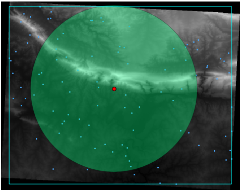
The red dot is the mean center; the large circle is the standard distance, which gives an indication of how closely the points are distributed around the mean center; and the rectangle is the bounding box, describing the smallest possible rectangle which will still enclose all the points.
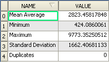
4.11. Follow Along: Minimum Distance Analysis
Often, the output of an algorithm will not be a shapefile, but rather a table summarizing the statistical properties of a dataset. One of these is the Minimum Distance Analysis tool.
- Find this tool in the Processing Toolbox as :guilabel:`Minimum
Distance Analysis`.
It does not require any other input besides specifying the vector point dataset to be analyzed.
Choisissez le jeu de données random_points.
- Click OK. On completion, a DBF table will appear in the Layers list.
- Select it, then open its attribute table. Although the figures may vary, your results will be in this format:
4.12. In Conclusion
QGIS allows many possibilities for analyzing the spatial statistical properties of datasets.
4.13. What’s Next?
Now that we’ve covered vector analysis, why not see what can be done with rasters? That’s what we’ll do in the next module!