Diálogo de propriedades do Raster
Para visualizar e definir as propriedades da camada de um layer, dê um duplo clique no nome da camada na legenda do mapa, ou clique com botão direito no nome da camada e escolha:Propriedades a partir do menu de contexto. Isto vai abrir o diálogo :guilabel:`Propriedades da camada Raster ` (ver figura_raster_1).
Existem vários menus na janela de dialogo:
Geral
Estilo
Transparência
Pirâmides
Histograma
Metadados
Figure Raster 1:
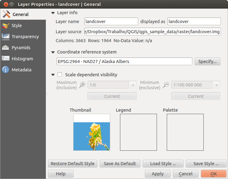
Raster Layers Properties Dialog 
Menu de Estilos
Representar a banda
QGIS offers four different Render types. The renderer chosen is dependent on the data type.
Color multibanda - se o arquivo vem como multibanda, com várias bandas (por exemplo, usado para imagens de satélite com várias bandas)
Mapa de Cores - se um arquivo de banda única vem com um mapa de cores indexado (por exemplo, usado para mapas topográficos digitais)
- Singleband gray - (one band of) the image will be rendered as gray; QGIS will choose this renderer if the file has neither multibands nor an indexed palette nor a continous palette (e.g., used with a shaded relief map)
Banda única Falsa Cor - este método de representação é usado em arquivos com mapa de cores contínuos ou com mapa de cores (por exemplo, para mapa de elevações)
Multibanda Colorida
Para representar em color multibanda, selecione três bandas da imagem que vai representar, cada banda representa respectivamente, a componente vermelha, verde e azul, que serão usadas para criar a cor da imagem. Podem-se escolher vários métodos para Melhora do contraste : ‘Sem melhora’, ‘Estique para MinMax’, ‘Estique e corte no MinMax’ e ‘Corte no min max’.
Figure Raster 2:
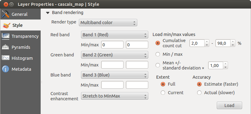
Raster Renderer - Multiband color
This selection offers you a wide range of options to modify the appearance
of your raster layer. First of all, you have to get the data range from your
image. This can be done by choosing the Extent and pressing
[Load]. QGIS can  Estimate (faster) the
Min and Max values of the bands or use the
Estimate (faster) the
Min and Max values of the bands or use the
 Actual (slower) Accuracy.
Now you can scale the colors with the help of the Load min/max values section.
A lot of images have a few very low and high data. These outliers can be eliminated
using the Cumulative count cut setting. The standard data range is set
from 2% to 98% of the data values and can be adapted manually. With this
setting, the gray character of the image can disappear.
With the scaling option Min/max, QGIS creates a color table with all of
the data included in the original image (e.g., QGIS creates a color table
with 256 values, given the fact that you have 8 bit bands).
You can also calculate your color table using the Mean +/- standard deviation x  .
Then, only the values within the standard deviation or within multiple standard deviations
are considered for the color table. This is useful when you have one or two cells
with abnormally high values in a raster grid that are having a negative impact on
the rendering of the raster.
.
Then, only the values within the standard deviation or within multiple standard deviations
are considered for the color table. This is useful when you have one or two cells
with abnormally high values in a raster grid that are having a negative impact on
the rendering of the raster.
All calculations can also be made for the Current extent.
Dica
Visualizando uma única banda do Raster Multibanda
Se deseja ver uma única banda de uma imagem multibanda (por exemplo apenas a Vermelha), pode-se colocar as bandas Verde e Azul como “Não definidas”, mas isto não é a forma correta. Para mostrar apenas a banda Vermelha, coloque o tipo da imagem como ‘Banda única Cinza’, depois selecione o Vermelho como a banda para usar no Cinza.
Mapa de Cores
This is the standard render option for singleband files that already include a color table, where each pixel value is assigned to a certain color. In that case, the palette is rendered automatically. If you want to change colors assigned to certain values, just double-click on the color and the Select color dialog appears. Also, in QGIS 2.2. it’s now possible to assign a label to the color values. The label appears in the legend of the raster layer then.
Figure Raster 3:
Raster Renderer - Paletted
Melhora do contraste
Nota
When adding GRASS rasters, the option Contrast enhancement will always be set automatically to stretch to min max, regardless of if this is set to another value in the QGIS general options.
Banda única cinza
This renderer allows you to render a single band layer with a Color gradient:
‘Black to white’ or ‘White to black’. You can define a Min
and a Max value by choosing the Extent first and
then pressing [Load]. QGIS can Estimate (faster) the
Min and Max values of the bands or use the
Actual (slower) Accuracy.
Figure Raster 4:
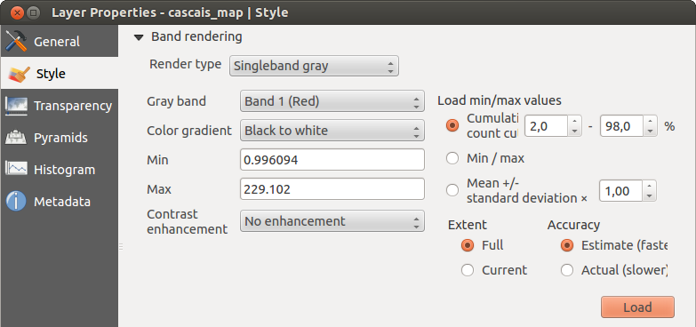
Raster Renderer - Singleband gray
With the Load min/max values section, scaling of the color table
is possible. Outliers can be eliminated using the Cumulative count cut setting.
The standard data range is set from 2% to 98% of the data values and can
be adapted manually. With this setting, the gray character of the image can disappear.
Further settings can be made with Min/max and
Mean +/- standard deviation x .
While the first one creates a color table with all of the data included in the
original image, the second creates a color table that only considers values
within the standard deviation or within multiple standard deviations.
This is useful when you have one or two cells with abnormally high values in
a raster grid that are having a negative impact on the rendering of the raster.
Singleband pseudocolor
This is a render option for single-band files, including a continous palette. You can also create individual color maps for the single bands here.
Figure Raster 5:
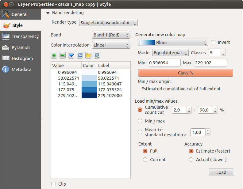
Raster Renderer - Singleband pseudocolor
Existem três tipos de interpolação de cores:
Método Discreto
Método Linear
Método Exato
In the left block, the button  Add values manually adds a value to the
individual color table. The button
Add values manually adds a value to the
individual color table. The button  Remove selected row
deletes a value from the individual color table, and the
Remove selected row
deletes a value from the individual color table, and the
 Sort colormap items button sorts the color table according
to the pixel values in the value column. Double clicking on the value column lets
you insert a specific value. Double clicking on the color column opens the dialog
Change color, where you can select a color to apply on that value. Further,
you can also add labels for each color, but this value won’t be displayed when you use the identify
feature tool.
You can also click on the button
Sort colormap items button sorts the color table according
to the pixel values in the value column. Double clicking on the value column lets
you insert a specific value. Double clicking on the color column opens the dialog
Change color, where you can select a color to apply on that value. Further,
you can also add labels for each color, but this value won’t be displayed when you use the identify
feature tool.
You can also click on the button  Load color map from band,
which tries to load the table from the band (if it has any). And you can use the
buttons
Load color map from band,
which tries to load the table from the band (if it has any). And you can use the
buttons  Load color map from file or
  Export color map to file to load an existing color table or to save the
defined color table for other sessions.
Export color map to file to load an existing color table or to save the
defined color table for other sessions.
In the right block, Generate new color map allows you to create newly
categorized color maps. For the Classification mode  ‘Equal interval’,
you only need to select the number of classes
and press the button Classify. You can invert the colors
of the color map by clicking the
‘Equal interval’,
you only need to select the number of classes
and press the button Classify. You can invert the colors
of the color map by clicking the  Invert
checkbox. In the case of the Mode ‘Continous’, QGIS creates
classes automatically depending on the Min and Max.
Defining Min/Max values can be done with the help of the Load min/max values section.
A lot of images have a few very low and high data. These outliers can be eliminated
using the Cumulative count cut setting. The standard data range is set
from 2% to 98% of the data values and can be adapted manually. With this
setting, the gray character of the image can disappear.
With the scaling option Min/max, QGIS creates a color table with all of
the data included in the original image (e.g., QGIS creates a color table
with 256 values, given the fact that you have 8 bit bands).
You can also calculate your color table using the Mean +/- standard deviation x .
Then, only the values within the standard deviation or within multiple standard deviations
are considered for the color table.
Invert
checkbox. In the case of the Mode ‘Continous’, QGIS creates
classes automatically depending on the Min and Max.
Defining Min/Max values can be done with the help of the Load min/max values section.
A lot of images have a few very low and high data. These outliers can be eliminated
using the Cumulative count cut setting. The standard data range is set
from 2% to 98% of the data values and can be adapted manually. With this
setting, the gray character of the image can disappear.
With the scaling option Min/max, QGIS creates a color table with all of
the data included in the original image (e.g., QGIS creates a color table
with 256 values, given the fact that you have 8 bit bands).
You can also calculate your color table using the Mean +/- standard deviation x .
Then, only the values within the standard deviation or within multiple standard deviations
are considered for the color table.
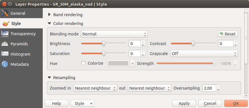
Representação das cores
Em cada Representação da banda, é possível encontrar uma Representação da cor
Podem-se fazer efeitos especias de representação para seus arquivo(s) raster, usando um dos modos de combinação (veja Janela de Propriedades de Vetor).
Further settings can be made in modifiying the Brightness, the Saturation and the Contrast. You can also use a Grayscale option, where you can choose between ‘By lightness’, ‘By luminosity’ and ‘By average’. For one hue in the color table, you can modify the ‘Strength’.
Reamostragem
A opção Reamostragem, faz a representação da imagem quando se dá mais ou menos zoom nela. Os modos de reamostragem podem melhorar a apariência do mapa. Eles calculam um novo valor de cinza através de uma transformação geométrica.
Figure Raster 6:
Raster Rendering - Resampling
Quando aplicamos o método ‘Vizinho mais próximo’, o mapa pode ter uma estrutura tipo pixelada, quando damos mais zoom. Essa apariència pode ser melhorada usando os métodos ‘Bilinear’ ou ‘Cúbico’., o qual causa que as feições mais afiadas, se suavizem.
Menu de transparência
QGIS has the ability to display each raster layer at a different transparency level.
Use the transparency slider  to indicate to what extent the underlying layers
(if any) should be visible though the current raster layer. This is very useful
if you like to overlay more than one raster layer (e.g., a shaded relief map
overlayed by a classified raster map). This will make the look of the map more
three dimensional.
to indicate to what extent the underlying layers
(if any) should be visible though the current raster layer. This is very useful
if you like to overlay more than one raster layer (e.g., a shaded relief map
overlayed by a classified raster map). This will make the look of the map more
three dimensional.
Além disso pode-se colocar um valor de pixel que será considerado como SEMDADOS no menu Valor adicional sem dados
Uma maneira ainda mais flexível de modificar a banda de transparência poder ser feita no :guilabel: Modificações das opções de transparência. Aqui podemos definir a transparência de cada pixel.
As an example, we want to set the water of our example raster file landcover.tif to a transparency of 20%. The following steps are neccessary:
Carregar o arquivo raster: Arquivo:landcover.tif.
Abra o diálogo Propriedades fazendo clique duplo no nome do raster na legenda, o clicando com botão e selecionando:Propriedades do menu pop-up.
Selecione o menu Transparência
No menu Transparência da banda, escolher ‘Nenhum’.
- Click the Add values manually
button. A new row will appear in the pixel list.
Entre o valor raster na coluna ‘De’ e ‘Até’ (usamos 0 aqui), e ajuste a transparência a 20%.
Pressione o botão [Aplicar] e visualize no mapa as modificações feitas.
Podemos repetir os passos 5 e 6 para definir mais valores com a transparência desejada.
As you can see, it is quite easy to set custom transparency, but it can be
quite a lot of work. Therefore, you can use the button  Export to file to save your transparency list to a file. The button
Import from file loads your transparency settings and
applies them to the current raster layer.
Export to file to save your transparency list to a file. The button
Import from file loads your transparency settings and
applies them to the current raster layer.
Menu de Pirâmides
Large resolution raster layers can slow navigation in QGIS. By creating lower resolution copies of the data (pyramids), performance can be considerably improved, as QGIS selects the most suitable resolution to use depending on the level of zoom.
Você deve pode ter direito de gravação no diretório onde os dados originais são armazenados para construir pirâmides.
Vários métodos de reamostragem podem ser usados para calcular as piramides.
Vizinho mais próximo
Média
- Gauss
Cúbico
Modo
Nenhum
If you choose ‘Internal (if possible)’ from the Overview format menu, QGIS tries to build pyramids internally. You can also choose ‘External’ and ‘External (Erdas Imagine)’.
Figure Raster 7:
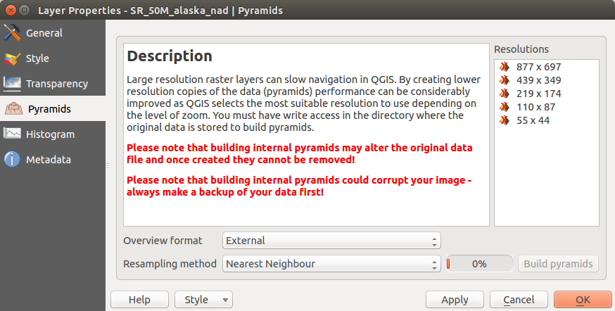
The Pyramids Menu
Note que o cálculo de pirâmides pode modificar o arquivo original de dados, e uma vez criado, não pode ser apagado. Se deseja preservar uma versão ‘sem pirâmides’ de seu raster, faça uma copia de segurança antes do cálculo das pirâmides.
Menu Histograma
The Histogram menu allows you to view the distribution of the bands
or colors in your raster. The histogram is generated automatically when you open the
Histogram menu. All existing bands will be displayed together. You can
save the histogram as an image with the button.
With the Visibility option in the  Prefs/Actions menu,
you can display histograms of the individual bands. You will need to select the option
Show selected band.
The Min/max options allow you to ‘Always show min/max markers’, to ‘Zoom
to min/max’ and to ‘Update style to min/max’.
With the Actions option, you can ‘Reset’ and ‘Recompute histogram’ after
you have chosen the Min/max options.
Prefs/Actions menu,
you can display histograms of the individual bands. You will need to select the option
Show selected band.
The Min/max options allow you to ‘Always show min/max markers’, to ‘Zoom
to min/max’ and to ‘Update style to min/max’.
With the Actions option, you can ‘Reset’ and ‘Recompute histogram’ after
you have chosen the Min/max options.
Figure Raster 8:
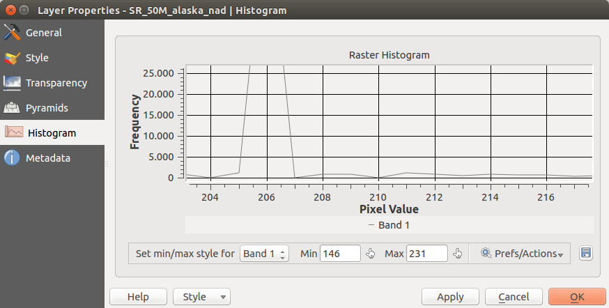
Raster Histogram
Menu Metadados
O menu Metadados, mostra o estado da informação da camada do raster, incluindo estatísticas de cada banda na camada do raster em uso. A partir deste menu, podem ser definidas entradas na guia Descrição, Atribuição, MetadadosUrl e Propriedades. Na guia:guilabel:Propriedades, são geradas estatísticas na base de ‘é preciso saber’ ou seja é possível que uma determinada e específica estatística da camada, no tenha sido ainda coletada.
Figure Raster 9:

Raster Metadata