` `
Proprietà raster
To view and set the properties for a raster layer, double click on the layer name in the map legend, or right click on the layer name and choose Properties from the context menu. This will open the Raster Layer Properties dialog (see figure_raster_properties).
Ci sono diverse schede nella finestra di dialogo:
- General
- Style
- Transparency
- Pyramids
- Histogram
- Metadata
- Legend

Raster Layers Properties Dialog
Suggerimento
Aggiornamenti in tempo reale
Il pannello Pannello Stile Layer ti fornisce alcune delle caratteristiche comuni della finestra di dialogo Proprietà layer ed è uno strumento semplice che puoi utilizzare per velocizzare la configurazione degli stili del layer e automaticamente visualizzare le modifiche apportate alla mappa.
Nota
Poiché le proprietà (simbologia, etichetta, azioni, valori predefiniti, forms...) dei layers nidificati (vedi Progetti nidificati) vengono estratte dal progetto originale, per evitare modifiche che potrebbero interrompere questo comportamento, la finestra di dialogo Proprietà Layer non è disponibile per questi layers.
General Properties
Layer Info
The General tab displays basic information about the selected raster, including the layer source path, the display name in the legend (which can be modified), and the number of columns, rows and no-data values of the raster.
Coordinate Reference System
Displays the layer’s Coordinate Reference System (CRS) as a PROJ.4 string. You
can change the layer’s CRS, selecting a recently used one in the drop-down list
or clicking on  Select CRS button (see Scelta del sistema di riferimento delle coordinate).
Use this process only if the CRS applied to the layer is a wrong one or if none
was applied. If you wish to reproject your data into another CRS, rather use
layer reprojection algorithms from Processing or Save it into another
layer.
Select CRS button (see Scelta del sistema di riferimento delle coordinate).
Use this process only if the CRS applied to the layer is a wrong one or if none
was applied. If you wish to reproject your data into another CRS, rather use
layer reprojection algorithms from Processing or Save it into another
layer.
Scale dependent visibility
Puoi impostare la scala a Massimo (incluso) e Minimumo (escluso), definendo un intervallo di scala in cui il layer sarà visibile. Fuori di questo intervallo, il layer sarà nascosto. Il pulsante  Imposta alla scala corrente dell’estensione di mappa ti consente di utilizzare la scala corrente della mappa come limite di visibilità del raster. Per maggiori informazioni vedi Visualizzazione in funzione della scala.
Style Properties
Visualizzazione banda
QGIS offre quattro Tipo visualizzazione. La scelta dipende dal tipo di dato.
- Multiband color - if the file comes as a multiband with several bands (e.g., used with a satellite image with several bands)
- Paletted - if a single band file comes with an indexed palette (e.g., used with a digital topographic map)
- Singleband gray - (one band of) the image will be rendered as gray; QGIS will choose this renderer if the file has neither multibands nor an indexed palette nor a continuous palette (e.g., used with a shaded relief map)
- Singleband pseudocolor - this renderer is possible for files with a continuous palette, or color map (e.g., used with an elevation map)
Multiband color
With the multiband color renderer, three selected bands from the image will be rendered, each band representing the red, green or blue component that will be used to create a color image. You can choose several Contrast enhancement methods: ‘No enhancement’, ‘Stretch to MinMax’, ‘Stretch and clip to MinMax’ and ‘Clip to min max’.
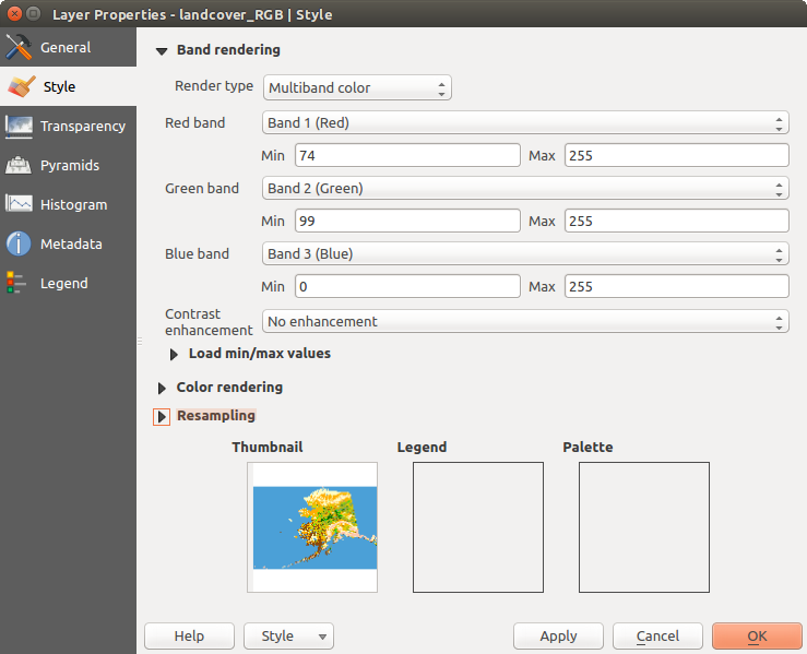
Raster Style - Multiband color rendering
This selection offers you a wide range of options to modify the appearance
of your raster layer. First of all, you have to get the data range from your
image. This can be done by choosing the Extent and pressing
[Load]. QGIS can  Estimate (faster) the
Min and Max values of the bands or use the
Estimate (faster) the
Min and Max values of the bands or use the
 Actual (slower) Accuracy.
Now you can scale the colors with the help of the Load min/max values
section. A lot of images have a few very low and high data. These outliers can be
eliminated using the Cumulative count cut setting.
The standard data range is set from 2% to 98% of the data values and can be adapted
manually. With this setting, the gray character of the image can disappear.
With the scaling option Min/max, QGIS creates a color
table with all of the data included in the original image (e.g., QGIS creates
a color table with 256 values, given the fact that you have 8 bit bands).
You can also calculate your color table using the Mean
+/- standard deviation x  .
Then, only the values within the standard deviation or within multiple standard deviations
are considered for the color table. This is useful when you have one or two cells
with abnormally high values in a raster grid that are having a negative impact on
the rendering of the raster.
.
Then, only the values within the standard deviation or within multiple standard deviations
are considered for the color table. This is useful when you have one or two cells
with abnormally high values in a raster grid that are having a negative impact on
the rendering of the raster.
All calculations can also be made for the Current extent.
Suggerimento
Visualizzare una singola banda di un raster multibanda
If you want to view a single band of a multiband image (for example, Red), you might think you would set the Green and Blue bands to “Not Set”. But this is not the correct way. To display the Red band, set the image type to ‘Singleband gray’, then select Red as the band to use for Gray.
Paletted
Questa è l’opzione normale di visualizzazione per i file a banda singola che includono già una tabella di colori, dove ad ogni valore di pixel viene assegnato un determinato colore. In questo caso, la tavolozza viene visualizzata automaticamente. Se vuoi modificare i colori assegnati a determinati valori, basta fare doppio click sul colore e viene visualizzata la finestra di dialogo Scegli colore. Inoltre, in QGIS puoi assegnare un’etichetta ai valori di colore. L’etichetta compare quindi nella legenda del layer raster.

Raster Style - Paletted Rendering
Miglioramento contrasto
Nota
Quando si aggiungono raster GRASS, l’opzione Miglioramento del contrasto sarà sempre impostata automaticamente su Stira a MinMax, indipendentemente dal fatto che sia impostata su un altro valore nelle opzioni generali di QGIS.
Singleband gray
This renderer allows you to render a single band layer with a Color gradient:
‘Black to white’ or ‘White to black’. You can define a Min
and a Max value by choosing the Extent first and
then pressing [Load]. QGIS can Estimate (faster)
the Min and Max values of the bands or use the
Actual (slower) Accuracy.
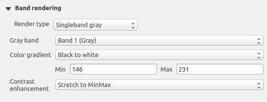
Raster Style - Singleband gray rendering
With the Load min/max values section, scaling of the color table
is possible. Outliers can be eliminated using the Cumulative
count cut setting.
The standard data range is set from 2% to 98% of the data values and can
be adapted manually. With this setting, the gray character of the image can disappear.
Further settings can be made with Min/max and
Mean +/- standard deviation x .
While the first one creates a color table with all of the data included in the
original image, the second creates a color table that only considers values
within the standard deviation or within multiple standard deviations.
This is useful when you have one or two cells with abnormally high values in
a raster grid that are having a negative impact on the rendering of the raster.
Singleband pseudocolor
Questa è l’opzione di visualizzazione per i file a banda singola che includono una tavolozza continua. Qui puoi anche creare mappe di colori specifici per le bande singole.
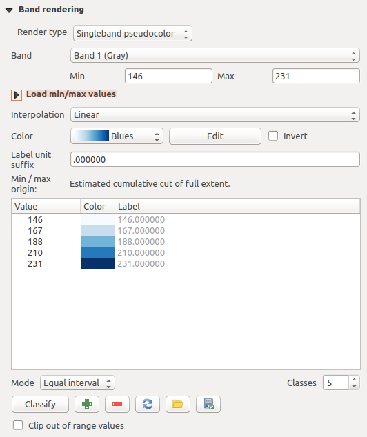
Raster Style - Singleband pseudocolor rendering
Three types of color interpolation are available:
- Discrete
Lineare
- Exact
In the left block, the button  Add values manually adds a value
to the individual color table. The button
Add values manually adds a value
to the individual color table. The button  Remove selected row
deletes a value from the individual color table, and the
Remove selected row
deletes a value from the individual color table, and the
 Sort colormap items button sorts the color table according
to the pixel values in the value column. Double clicking on the value column
lets you insert a specific value. Double clicking on the color column opens the dialog
Change color, where you can select a color to apply on that value.
Further, you can also add labels for each color, but this value won’t be displayed
when you use the identify feature tool.
You can also click on the button
Sort colormap items button sorts the color table according
to the pixel values in the value column. Double clicking on the value column
lets you insert a specific value. Double clicking on the color column opens the dialog
Change color, where you can select a color to apply on that value.
Further, you can also add labels for each color, but this value won’t be displayed
when you use the identify feature tool.
You can also click on the button  Load color map from band,
which tries to load the table from the band (if it has any). And you can use the
buttons
Load color map from band,
which tries to load the table from the band (if it has any). And you can use the
buttons  Load color map from file or
  Export color map to file to load an existing color table or to save the
defined color table for other sessions.
Export color map to file to load an existing color table or to save the
defined color table for other sessions.
In the right block, Generate new color map allows you to create newly
categorized color maps. For the Classification mode  ‘Equal interval’, you only need to select the number of classes
and press the button Classify. You can invert the colors
of the color map by clicking the
‘Equal interval’, you only need to select the number of classes
and press the button Classify. You can invert the colors
of the color map by clicking the  Invert
checkbox. In the case of the Mode ‘Continuous’, QGIS creates
classes automatically depending on the Min and Max.
Defining Min/Max values can be done with the help of the Load min/max values section.
A lot of images have a few very low and high data. These outliers can be eliminated
using the Cumulative count cut setting. The standard
data range is set from 2% to 98% of the data values and can be adapted manually.
With this setting, the gray character of the image can disappear.
With the scaling option Min/max, QGIS creates a color
table with all of the data included in the original image (e.g., QGIS creates a
color table with 256 values, given the fact that you have 8 bit bands).
You can also calculate your color table using the Mean +/-
standard deviation x .
Then, only the values within the standard deviation or within multiple standard deviations
are considered for the color table.
Invert
checkbox. In the case of the Mode ‘Continuous’, QGIS creates
classes automatically depending on the Min and Max.
Defining Min/Max values can be done with the help of the Load min/max values section.
A lot of images have a few very low and high data. These outliers can be eliminated
using the Cumulative count cut setting. The standard
data range is set from 2% to 98% of the data values and can be adapted manually.
With this setting, the gray character of the image can disappear.
With the scaling option Min/max, QGIS creates a color
table with all of the data included in the original image (e.g., QGIS creates a
color table with 256 values, given the fact that you have 8 bit bands).
You can also calculate your color table using the Mean +/-
standard deviation x .
Then, only the values within the standard deviation or within multiple standard deviations
are considered for the color table.
Visualizzazione colore
Per ogni Visualizzazione banda, è disponibile una Visualizzazione colore.
Puoi anche ottenere effetti speciali per i tuoi file(s) raster usando una delle modalità di fusione (vedi Metodi di fusione).
Ulteriori impostazioni possono essere fatte modificando la Luminosità, la Saturazione e il Contrasto. Puoi usare anche l’opzione Scala di grigi dove puoi scegliere fra ‘Per chiarezza’, ‘Per luminosità’ e ‘Per media’. Puoi modificare la ‘Forza’ per ogni tonalità della tabella dei colori.
Ricampionamento
La sezione Ricampionamento ha effetto quando ingrandisci o rimpicciolisci l’immagine. I metodi di ricampionamento ottimizzano l’aspetto della mappa perché calcolano una nuova matrice di grigi attraverso una trasformazione geometrica.

Raster Style - Color rendering and Resampling settings
Applicando il metodo ‘vicino più prossimo’ la mappa potrebbe avere una struttura con molti pixel quando viene ingrandita. Questo aspetto può essere migliorato usando i metodi ‘Bilineare’ o ‘Cubico’ perché creano delle geometrie più appuntite e offuscate. Il risultato è un’immagine più morbida. Puoi applicare questo metodo, per esempio, a mappe raster topografiche.
At the bottom of the Style tab, you can see a thumbnail of the layer, its legend symbol, and the palette.
Scheda Trasparenza
QGIS has the ability to display each raster layer at a different transparency level.
Use the transparency slider  to indicate to what extent the underlying layers
(if any) should be visible though the current raster layer. This is very useful
if you like to overlay more than one raster layer (e.g., a shaded relief map
overlayed by a classified raster map). This will make the look of the map more
three dimensional.
to indicate to what extent the underlying layers
(if any) should be visible though the current raster layer. This is very useful
if you like to overlay more than one raster layer (e.g., a shaded relief map
overlayed by a classified raster map). This will make the look of the map more
three dimensional.
Inoltre puoi inserire un valore del dato raster che deve essere trattato come NODATA con la opzione Valori nulli aggiuntivi.
An even more flexible way to customize the transparency can be done in the Custom transparency options section. The transparency of every pixel can be set here.
As an example, we want to set the water of our example raster file landcover.tif to a transparency of 20%. The following steps are necessary:
- Load the raster file landcover.tif.
- Open the Properties dialog by double-clicking on the raster name in the legend, or by right-clicking and choosing Properties from the pop-up menu.
- Select the Transparency tab.
- From the Transparency band drop-down menu, choose ‘None’.
Clicca sul pulsante
Aggiungi valori manualmente. Apparirà cosi una nuova riga.- Enter the raster value in the ‘From’ and ‘To’ column (we use 0 here), and adjust the transparency to 20%.
- Press the [Apply] button and have a look at the map.
You can repeat steps 5 and 6 to adjust more values with custom transparency.
Come puoi vedere è molto semplice impostare una trasparenza personalizzata, però richiede comunque un po’ di lavoro. Proprio per questo puoi usare il pulsante  Esporta su file per salvare la lista dei valori su un file esterno. Il pulsante Importa da file ti permette di caricare le impostazioni di trasparenza e applicarle al raster selezionato.
Proprietà delle Piramidi
I raster ad alta risoluzione possono rallentare notevolmente il lavoro in QGIS. Creando copie a bassa risoluzione dei dati (piramidi) puoi incrementare notevolmente le prestazioni in quanto QGIS sceglierà la risoluzione migliore in funzione del fattore di zoom.
Per creare piramidi devi avere i permessi di scrittura nella cartella contenente il dato originale: in questa cartella verranno salvate le copie a bassa risoluzione.
Dall’elenco Risoluzioni, seleziona le risoluzioni per le quali si desidera creare la piramide facendo clic su di esse.
Se scegli Interno (se possibile) dal menu a tendina Formato panoramica, QGIS proverà a costruire le piramidi internamente.
Nota
La costruzione delle piramidi può alterare il dato originale in maniera irreversibile, quindi ti raccomandiamo di fare una copia del raster originale prima di eseguire l’operazione.
Se scegli Esterno e Esterno (immagine Erdas) le piramidi verranno create in un file accanto al raster originale con lo stesso nome e un’estensione .ovr.
Diversi metodi di Ricampionamento possono essere utilizzati per calcolare le piramidi:
Vicino più prossimo (metodo Nearest Neighbour)
Media
- Gauss
Cubico
Modo
Nessuno
Finally, click [Build pyramids] to start the process.
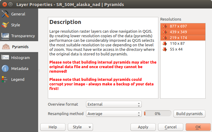
Piramidi raster
Proprietà Istogramma
The Histogram tab allows you to view the distribution of the bands
or colors in your raster. The histogram is generated automatically when you open the
Histogram tab. All existing bands will be displayed together. You
can save the histogram as an image with the button.
With the Visibility option in the  Prefs/Actions menu,
you can display histograms of the individual bands. You will need to select the option
Show selected band.
The Min/max options allow you to ‘Always show min/max markers’, to ‘Zoom
to min/max’ and to ‘Update style to min/max’.
With the Actions option, you can ‘Reset’ and ‘Recompute histogram’ after
you have chosen the Min/max options.
Prefs/Actions menu,
you can display histograms of the individual bands. You will need to select the option
Show selected band.
The Min/max options allow you to ‘Always show min/max markers’, to ‘Zoom
to min/max’ and to ‘Update style to min/max’.
With the Actions option, you can ‘Reset’ and ‘Recompute histogram’ after
you have chosen the Min/max options.

Istogramma del raster
Proprietà Metadati
The Metadata tab displays a wealth of information about the raster layer, including statistics about each band in the current raster layer. From this tab, entries may be made for the Description, Attribution, MetadataUrl and Properties. In Properties, statistics are gathered on a ‘need to know’ basis, so it may well be that a given layer’s statistics have not yet been collected.
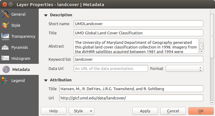
Raster Metadata
Proprietà Legenda
The Legend tab provides you with a list of widgets you can embed within the layer tree in the Layers panel. The idea is to have a way to quickly access some actions that are often used with the layer (setup transparency, filtering, selection, style or other stuff...).
Per impostazione predefinita, QGIS fornisce il widget di trasparenza ma a questa opzione possono aggiungersi i widget dei plugin che hanno propri widget e assegnano azioni personalizzate ai layer che gestiscono.