17.14. Primeiro exemplo de análise
Nota
Nesta lição vamos fazer uma análise real utilizando apenas a caixa de ferramentas para que possa ter mais familiaridade com os elementos da área de trabalho de processamento.
Now that everything is configured and we can use external algorithms, we have a very powerful tool to perform spatial analysis. It is time to work out a larger exercise with some real–world data.
We will be using the well-known dataset that John Snow used in 1854, in his groundbreaking work (http://en.wikipedia.org/wiki/John_Snow_%28physician%29), and we will get some interesting results. The analysis of this dataset is pretty obvious and there is no need for sofisticated GIS techniques to end up with good results and conclusions, but it is a good way of showing how these spatial problems can be analyzed and solved by using different processing tools.
The dataset contains shapefiles with cholera deaths and pump locations, and an OSM rendered map in TIFF format. Open the corresponding QGIS project for this lesson.
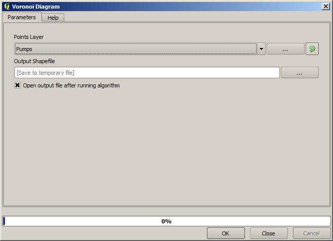
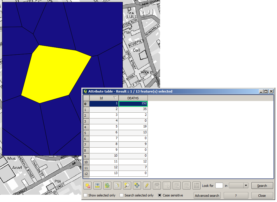
The first thing to do is to calculting the Voronoi diagram (a.k.a. Thyessen polygons) of the pumps layer, to get the influence zone of each pump. The Voronoi Diagram algorithm can be used for that.
Muito fácil, porém ele nos dará informação interessantes.
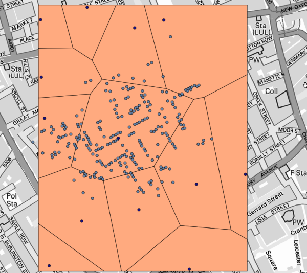
Claramente, muitos casos estão dentro de um dos polígonos
To get a more quantitative result, we can count the number of deaths in each polygon. Since each point represents a building where deaths occured, and the number of deaths is stored in an attribute, we cannot just count the points. We need a weighted count, so we will use the Count points in polygon (weighted) tool.
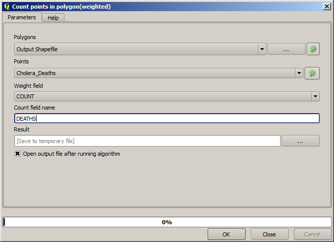
The new field will be called DEATHS, and we use the COUNT field as weighting field. The resulting table clearly reflects that the number of deaths in the polygon corresponding to the first pump is much larger than the other ones.
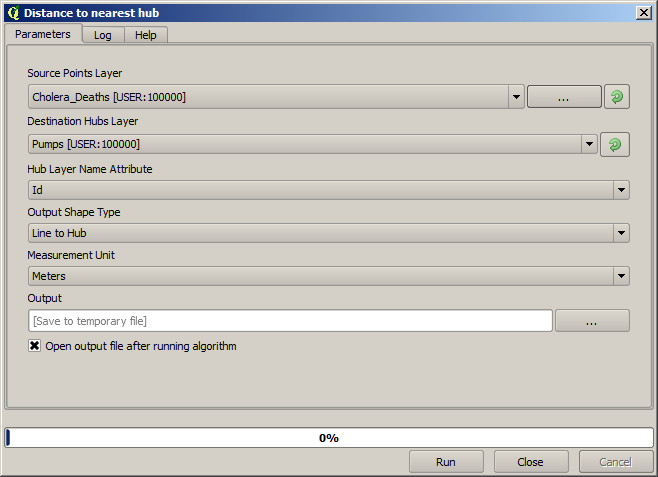
Another good way of visualizing the dependence of each point in the Cholera_deaths layer with a point in the Pumps layer is to draw a line to the closest one. This can be done with the Distance to closest hub tool, and using the configuration shown next.
O resultado se parece com isso:
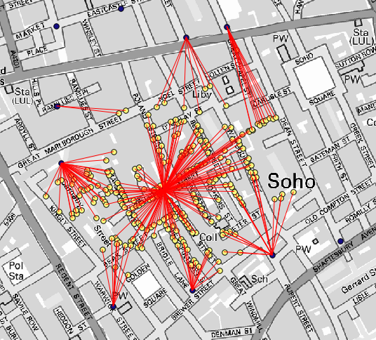
Although the number of lines is larger in the case of the central pump, do not forget that this does not represent the number of deaths, but the number of locations where cholera cases were found. It is a representative parameter, but it is not considering that some locations might have more cases than other.
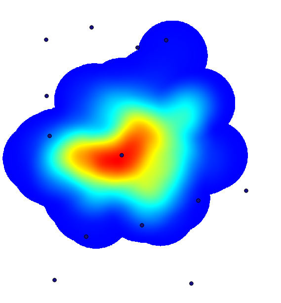
A density layer will also give us a very clear view of what is happening. We can create it with the Kernel density algorithm. Using the Cholera_deaths layer, its COUNT field as weight field, with a radius of 100, the extent and cellsize of the streets raster layer, we get something like this.
Lembre-se que, para obter a extensão de saída, você não precisa digitá-lo. Clique no botão no lado direito e selecione Use camada/extensão da área do mapa.
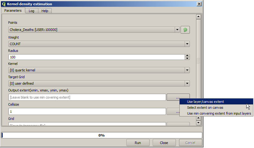
Seleccione la capa de calles ráster y su extensión automáticamente se añadirá al campo de texto. Debe hacer lo mismo con el tamaño de celda, seleccionando el tamaño de celda de esa capa también.
La combinación con la capa de bombas, vemos que hay una bomba claramente en el punto de acceso donde se encuentra la máxima densidad de los casos de muerte.