3.3. Lesson: 범주화
Labels are a good way to communicate information such as the names of
individual places, but they can’t be used for everything.
For example, let us say that someone wants to know what each
landuse area is used for.
Using labels, you would get this:
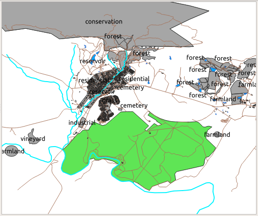
라벨을 읽기 어려울 뿐만 아니라 맵 상에 수많은 토지이용구역이 있을 경우 혼잡하기까지 합니다.
이 강의의 목표: 벡터 데이터를 효율적으로 범주화하는 방법 배우기.
3.3.1.  Follow Along: 명칭 데이터 범주화
Open the Layer Properties dialog for the
landuselayerGo to the Symbology tab
Single Symbol 이라는 드롭다운 메뉴를 클릭해서, Categorized 로 변경하십시오.

In the new panel, change the Value to
landuseand the Color ramp to Random colorsClick the button labeled Classify
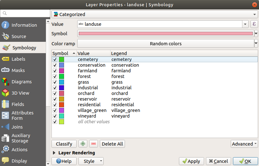
OK 를 클릭합니다.
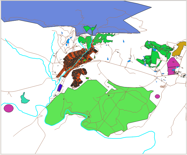
결과는 다음과 같습니다.
Click the arrow (or plus sign) next to
landusein the Layers panel, you’ll see the categories explained: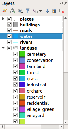
Now our landuse polygons are colored and are classified so that areas with the same land use are the same color.
If you wish to, you can change the symbol of each landuse area by double-clicking the relevant color block in the Layers panel or in the Layer Properties dialog:

비어 있는 카테고리가 하나 있는 게 보이십니까?
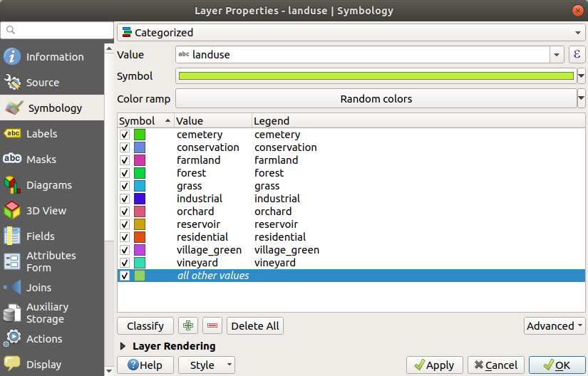
This empty category is used to color any objects which do not have a landuse value defined or which have a NULL value. It can be useful to keep this empty category so that areas with a NULL value are still represented on the map. You may like to change the color to more obviously represent a blank or NULL value.
여러분이 힘들게 바꾼 변경 사항을 잃지 않도록 지금 맵을 저장하세요!
3.3.2.  Try Yourself 고급 범주화
Use the knowledge you gained above to classify the buildings layer.
Set the categorisation against the building field and use the
Spectral color ramp.
참고
결과를 보려면 도심 지역으로 줌인해야 합니다.
3.3.3.  Follow Along: 비율 범주화
범주화에는 명칭, 순서, 간격, 그리고 비율, 네 가지 유형이 있습니다.
In nominal classification, the categories that objects are classified into are name-based; they have no order. For example: town names, district codes, etc. Symbols that are used for nominal data should not imply any order or magnitude.
For points, we can use symbols of different shape.
For polygons, we can use different types of hatching or different colours (avoid mixing light and dark colours).
For lines, we can use different dash patterns, different colours (avoid mixing light and dark colours) and different symbols along the lines.
In ordinal classification, the categories are arranged in a certain order. For example, world cities are given a rank depending on their importance for world trade, travel, culture, etc. Symbols that are used for ordinal data should imply order, but not magnitude.
For points, we can use symbols with light to dark colours.
For polygons, we can use graduated colours (light to dark).
For lines, we can use graduated colours (light to dark).
In interval classification, the numbers are on a scale with positive, negative and zero values. For example: height above/below sea level, temperature in degrees Celsius. Symbols that are used for interval data should imply order and magnitude.
For points, we can use symbols with varying size (small to big).
For polygons, we can use graduated colours (light to dark) or add diagrams of varying size.
For lines, we can use thickness (thin to thick).
In ratio classification, the numbers are on a scale with only positive and zero values. For example: temperature above absolute zero (0 degrees Kelvin), distance from a point, the average amount of traffic on a given street per month, etc. Symbols that are used for ratio data should imply order and magnitude.
For points, we can use symbols with varying size (small to big).
For polygons, we can use graduated colours (light to dark) or add diagrams of varying size.
For lines, we can use thickness (thin to thick).
In the example above, we used nominal classification to color each
record in the landuse layer based on its landuse attribute.
Now we will use ratio classification to classify the records by area.
We are going to reclassify the layer, so existing classes will be lost if not saved. To store the current classification:
Open the layer’s properties dialog
Click the Save Style … button in the Style drop-down menu.
Select Rename Current…, enter
land usageand press OK.The categories and their symbols are now saved in the layer’s properties.
Click now on the Add… entry of the Style drop-down menu and create a new style named
ratio. This will store the new classification.Close the Layer Properties dialog
We want to classify the landuse areas by size, but there is a problem: they don’t have a size field, so we’ll have to make one.
Open the Attributes Table for the
landuselayer.Add a new column of decimal type, called
AREA, using the New field button:
OK 를 클릭합니다.
The new field will be added (at the far right of the table; you may need to scroll horizontally to see it). However, at the moment it is not populated, it just has a lot of NULL values.
To solve this problem, we will need to calculate the areas.
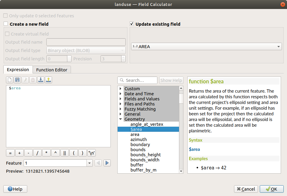
Open the field calculator with the
 button.
You will get this dialog:

Select AREA in the fields drop-down menu

Under the Expression tab, expand the Geometry functions group in the list and find
Double-click on it so that it appears in the Expression field
OK 를 클릭합니다.
Scroll to the
AREAfield in the attribute table and you will notice that it is populated with values (you may need to click the column header to refresh the data).
참고
These areas respect the project’s area unit settings, so they may be in square meters or square degrees.
Press
 to save the edits and exit the edit mode with
 Toggle editing
Close the attribute table
Now that we have the data, let’s use them to render the landuse layer.
Open the Layer properties dialog’s Symbology tab for the
landuselayerChange the classification style from Categorized to Graduated
Change the Value to
AREAUnder Color ramp, choose the option Create New Color Ramp…:
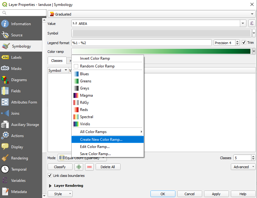
Choose Gradient (if it’s not selected already) and click OK. You will see this:

이 창을 이용해서, 적은 면적을 Color 1 로, 큰 면적을 Color 2 로 나타낼 것입니다.
Choose appropriate colors
이 예제에서는 다음과 비슷한 결과가 나옵니다.

OK 를 클릭합니다.
You can save the colour ramp by selecting Save Color Ramp… under the Color ramp tab. Choose an appropriate name for the colour ramp and click Save. You will now be able to select the same colour ramp easily under All Color Ramps.
Click Classify
Now you will have something like this:
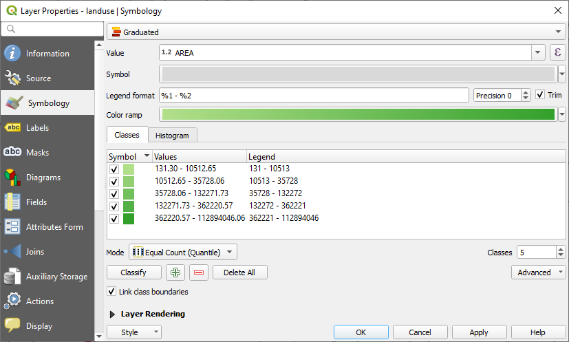
다른 항목은 그대로 놔둡니다.
Click OK:
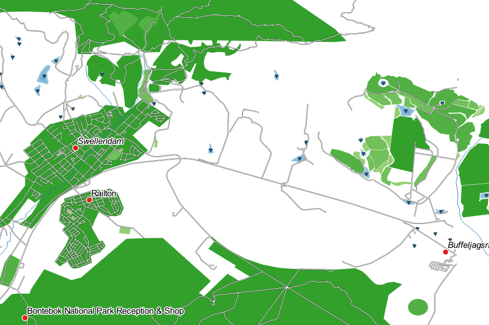
3.3.5.  Follow Along: 규칙 기반 범주화
범주화에 복수의 기준을 결합하는 것이 유용할 경우가 많지만, 아쉽게도 일반 범주화에서는 단일 기준만 적용됩니다. 이런 경우 규칙 기반 범주화를 쓸 수 있습니다.
In this lesson, we will represent the landuse layer in a way to
easily identify Swellendam city from the other residential area,
and from the other types of landuse (based on their area).
Open the Layer Properties dialog for the
landuselayerSwitch to the Symbology tab
Switch the classification style to Rule-based
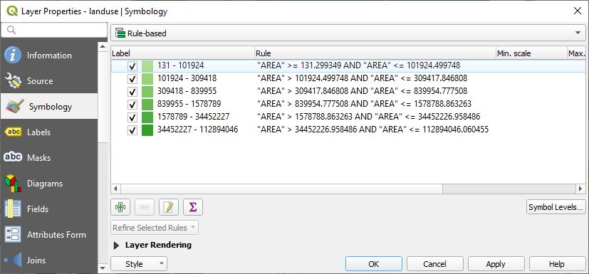
QGIS will automatically show the rules that represent the current classification implemented for this layer. For example, after completing the exercise above, you may see something like this:
Click and drag to select all the rules
Use the
 Remove selected rules button to remove
all of the existing rules
Let’s now add our custom rules.
The Edit rule dialog then appears
Enter
Swellendam cityas LabelClick the
 button next to the Filter text
area to open the Expression String Builder
button next to the Filter text
area to open the Expression String BuilderEnter the criterion
"name" = 'Swellendam'and validate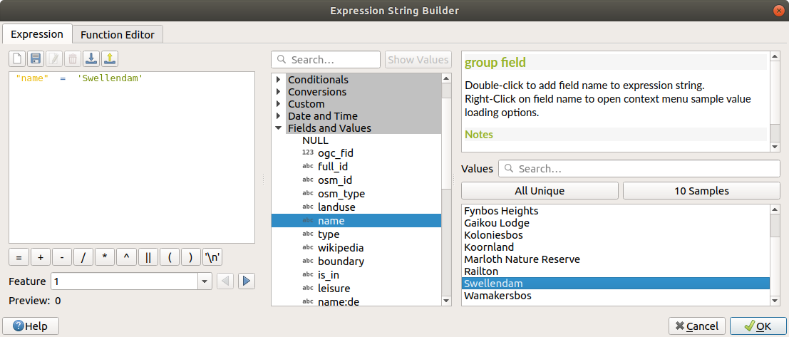
Back to the Edit rule dalog, assign it a darker grey-blue color in order to indicate the town’s importance in the region and remove the border

OK 를 클릭하십시오.
Repeat the steps above to add the following rules:
Other residential label with the criterion
"landuse" = 'residential' AND "name" <> 'Swellendam'(or"landuse" = 'residential' AND "name" != 'Swellendam'). Choose a pale blue-grey Fill colorBig non residential areas label with the criterion
"landuse" <> 'residential' AND "AREA" >= 605000. Choose a mid-green color.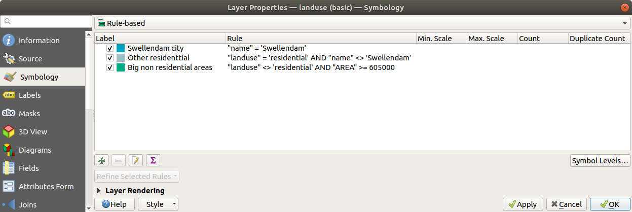
These filters are exclusive, in that they exclude areas on the map (non-residential areas which are smaller than 605000 (square meters) are not included in any of the rules).
We will catch the remaining features using a new rule labeled Small non residential areas. Instead of a filter expression, Check the
 Else.
Give this category a suitable pale green color.
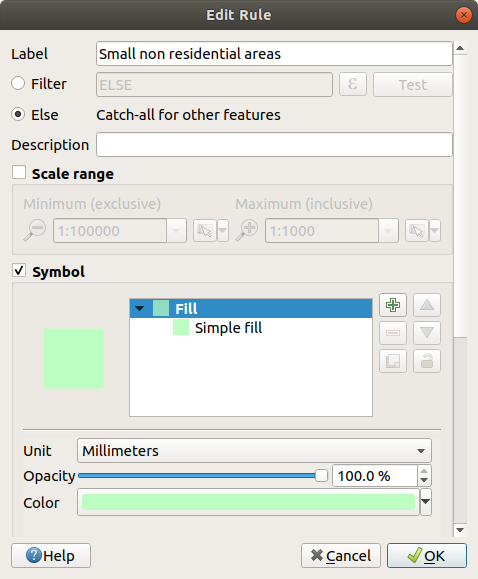
Your rules should now look like this:
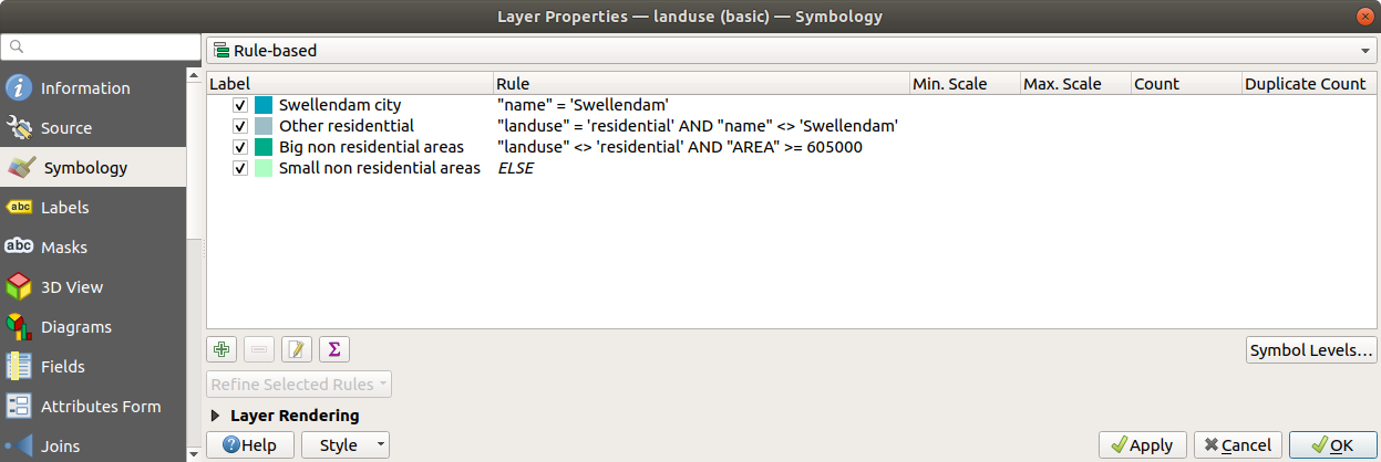
Apply this symbology
사용자 맵이 다음과 비슷하게 보일 것입니다.
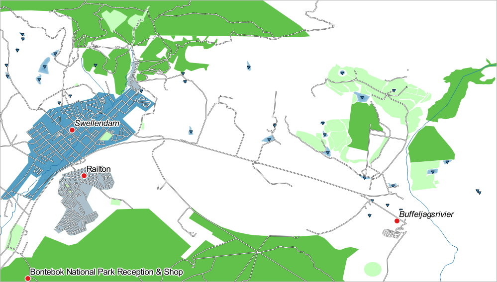
이제 Swellendam 이 가장 두드러진 주거지역으로 나타나고 다른 비주거지역은 면적에 따라 다른 색상을 보여주는 맵이 되었습니다.
3.3.6. In Conclusion
심볼을 이용하면 레이어의 속성들을 읽기 쉬운 방법으로 나타낼 수 있습니다. 우리가 선택한 연관 속성을 이용해서 피처의 중요성을 이해하도록 만들 수 있습니다. 여러분이 당면한 문제가 무엇이냐에 따라 다른 범주화 기술을 적용해서 문제를 해결하십시오.
3.3.7. What’s Next?
이제 멋진 맵을 만들었습니다만, 이것을 어떻게 QGIS에서 분리시켜 인쇄할 수 있는 파일 형식이나 이미지 또는 PDF로 만들 수 있을까요? 이것이 다음 강의의 주제입니다!

