8.2. Lesson: Schimbarea Simbologiei Raster
Not all raster data consists of aerial photographs. There are many other forms of raster data, and in many of those cases, it’s essential to symbolize the data properly so that it becomes properly visible and useful.
Scopul acestei lecții: De a schimba simbolistica pentru un strat raster.
8.2.1.  Try Yourself
Începeți cu harta actuală, care ar fi trebuit să fie creată în timpul exercițiului precedent: analysis.qgs.
Folosiți butonul Add Raster Layer pentru a încărca noul set de date.
Încărcați setul de date srtm_41_19.tif, de sub directorul exercise_data/raster/SRTM/.
O dată ce apare în Lista straturilor, redenumiți-l DEM.
Focusați pe extinderea acestui strat prin clic-dreapta pe el în Lista Straturilor, apoi selectați Zoom to Layer Extent.
This dataset is a Digital Elevation Model (DEM). It’s a map of the elevation (altitude) of the terrain, allowing us to see where the mountains and valleys are, for example.
Once it’s loaded, you’ll notice that it’s a basic stretched grayscale representation of the DEM. It’s seen here with the vector layers on top:
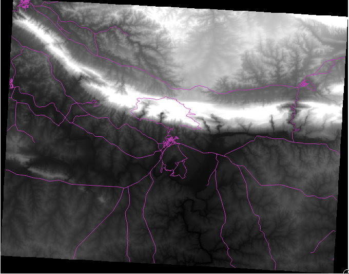
QGIS has automatically applied a stretch to the image for visualization purposes, and we will learn more about how this works as we continue.
8.2.2. Follow Along: Schimbarea Simbologiei Straturilor Raster
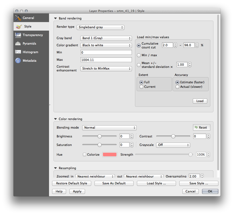
- Open the Layer Properties dialog for the SRTM layer by right-clicking on the layer in the Layer tree and selecting Properties option.
Mergeți la fila Stil.
These are the current settings that QGIS applied for us by default. Its just one way to look at a DEM, so lets explore some others.
Schimbați Tipul Randării pe Singleband pseudocolor, și folosiți opțiunile implicite prezentate.
- Click the Classify button to generate a new color classification, and click OK to apply this classification to the DEM.

Veți vedea un raster care arată în felul următor:
Acesta este un mod interesant de a privi DEM-ul, dar poate că nu dorim să-l simbolizăm folosind aceste culori.
Deschideți iarăși dialogul Layer Properties.
Schimbați Tipul Randării înapoi pe Singleband gray.
Faceți clic pe Ok pentru a aplica aceste setări rasterului.
Veți vedea acum un dreptunghi complet gri, care nu este foarte util.
This is because we have lost the default settings which “stretch” the color values to show them contrast.
Let’s tell QGIS to again “stretch” the color values based on the range of data in the DEM. This will make QGIS use all of the available colors (in Grayscale, this is black, white and all shades of gray in between).
Specificați valorile Min și Max așa cum se arată mai jos.
Setați valoarea Contrast enhancement pe Stretch To MinMax:

But what are the minimum and maximum values that should be used for the stretch? The ones that are currently under Min and Max values are the same values that just gave us a gray rectangle before. Instead, we should be using the minimum and maximum values that are actually in the image, right? Fortunately, you can determine those values easily by loading the minimum and maximum values of the raster.
Sub Load min / max values, selectați opțiuna Min / Max.
Clic pe butonul Încărcare:
Rețineți că Valorile personalizate min / max s-au schimbat, pentru a reflecta valorile reale din DEM-ul nostru:
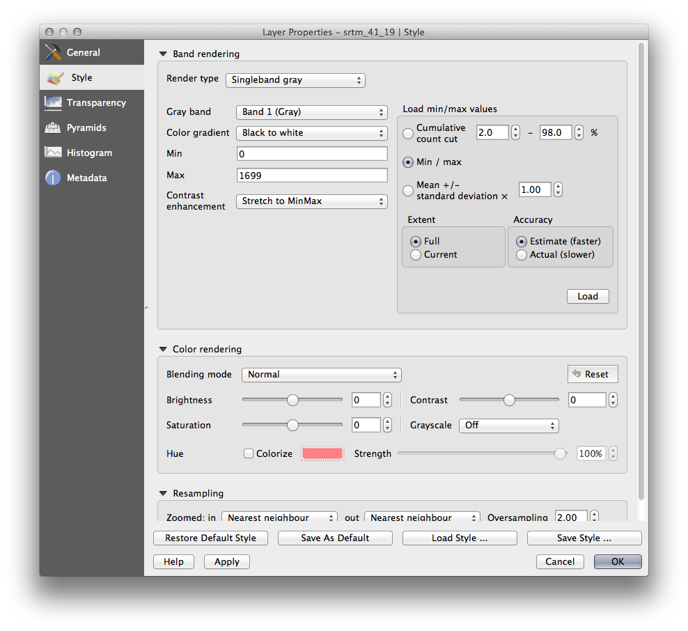
Faceți clic pe Ok pentru a aplica aceste setări imaginii.
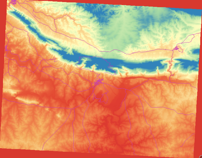
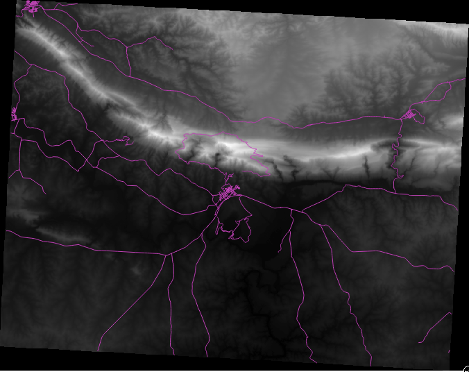
You’ll now see that the values of the raster are again properly displayed, with the darker colors representing valleys and the lighter ones, mountains:
8.2.2.1. Dar nu există o modalitate mai bună sau mai ușoară?
Yes, there is. Now that you understand what needs to be done, you’ll be glad to know that there’s a tool for doing all of this easily.
Scoateți DEM-ul curent din Lista straturilor.
Încărcați rasterul din nou, redenumindu-l DEM, ca mai înainte. Este, din nou, un dreptunghi gri...
Activați instrumentul de care veți avea nevoie View ‣ Toolbars ‣ Raster. Aceste pictograme vor apărea în interfață:
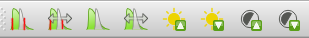
The third button from the left Local Histogram Stretch will automatically stretch the minimum and maximum values to give you the best contrast in the local area that you’re zoomed into. It’s useful for large datasets. The button on the left Local Cumulative Cut Stretch ... will stretch the minimum and maximum values to constant values across the whole image.
- Click the fourth button from the left (Stretch Histogram to Full Dataset). You’ll see the data is now correctly represented as before.
You can try the other buttons in this toolbar and see how they alter the stretch of the image when zoomed in to local areas or when fully zoomed out.
8.2.3. In Conclusion
These are only the basic functions to get you started with raster symbology. QGIS also allows you many other options, such as symbolizing a layer using standard deviations, or representing different bands with different colors in a multispectral image.
8.2.4. Referință
Setul de date SRTM a fost obținut de la http://srtm.csi.cgiar.org/
8.2.5. What’s Next?
Acum, că putem vedea datele noastre afișate corect, să investigăm modul în care putem analiza mai departe.