8.2. Lesson: Changing Raster Symbology
Non tutti i raster sono fotografie aeree. Ci sono molte altre forme di dati raster e in questi casiè essenziale rappresentare i dati correttamente per renderli significativi e utili.
Obiettivo: modificare la simbologia del raster.
8.2.1. |base| Try Yourself
Inizia con la mappa preparata nel precedente esercizio: analysis.qgs.
Usa il pulsante Aggiungi raster per caricare il nuovo insieme di dati raster.
Carica srtm_41_19.tif, che trovi nella cartella exercise_data/raster/SRTM/.
Quando appare Layers list, rinominalo DEM.
Visualizza tutto il raster, click destro sul raster nella lista dei layer , selezionando Zoom sul layer.
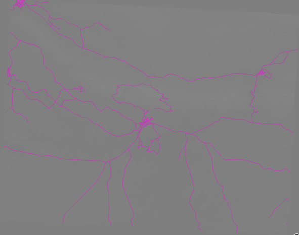
L’insieme di dati è un Modello digitale di elevazione (DEM). E’ una mappa di elevazione ((altitudine) del terreno che permette, per esempio, la visione di valli e montagne.
Una volta caricato, puoi vedere che si tratta di una rappresentazione in scala di grigi del DEM. Qui è rappresentato con la sovrapposizione dei vettoriali:
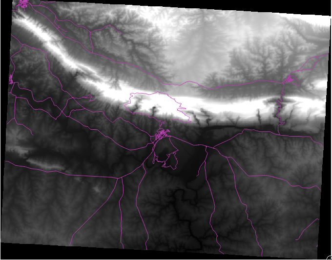
QGIS ha applicato automaticamente uno stiraento dell’immagine per la visualizzazione, su cui imparerai più avanti.
8.2.2. Modificare la simbologia raster
Apri la finestra Proprietà Layer ` del raster :guilabel:`SRTM col click destr sul layer nella lista dei layer e seleziona Proprietà.
Spostati sulla scheda Stile.
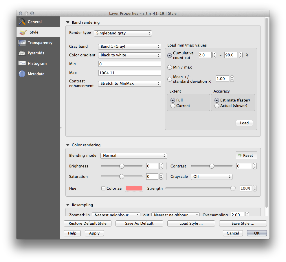
Queste sono le impostazioni predefinite da QGIS. E’ una modalità di vedere iil DEM, provane altre.
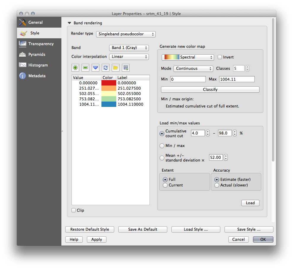
Cambia Tipo visualizzazione in Banda singola falso colore, e usa le opzioni predefinite.
Click il pulsante Classifica per generare una nuova classificazione dei colori, e click OK per applicarla al DEM.
Vedrai questo:
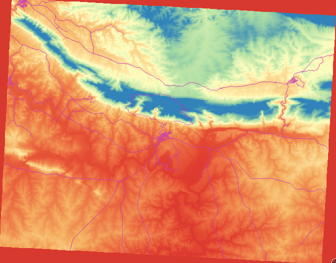
Questo è un modo interessante di visualizzare il DEM, ma puoi usare anche altri colori.
Apri di nuovo la finestra Proprietà layer.
Cambia Tipo visualizzazione in Banda singola grigia.
Click OK per applicare le impostazioni del raster.
Vedrai un rettangolo totalmente grigio non molto utile.
Questo perchè hai perso le impostazioni predefinite che “distendono” i colori per mostrare i contrasti.
Let’s tell QGIS to again “stretch” the color values based on the range of data in the DEM. This will make QGIS use all of the available colors (in Grayscale, this is black, white and all shades of gray in between).
- Specify the Min and Max values as shown below.
- Set the value Contrast enhancement to Stretch To MinMax:
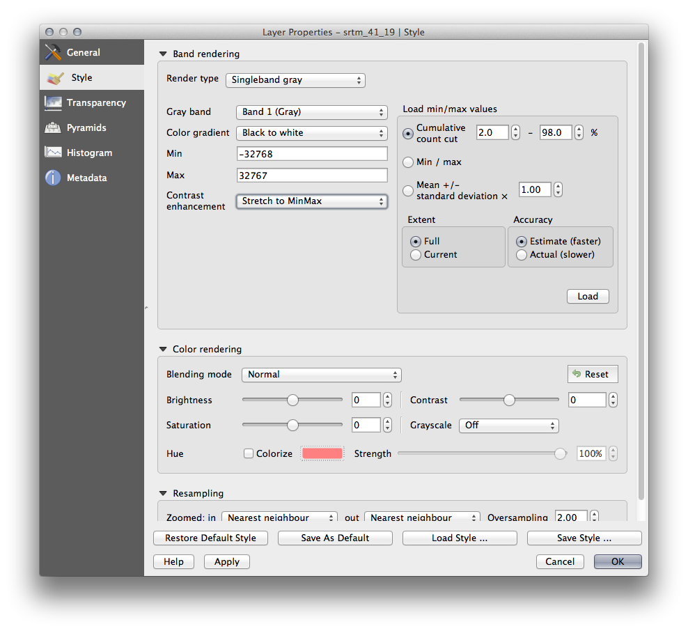
But what are the minimum and maximum values that should be used for the stretch? The ones that are currently under Min and Max values are the same values that just gave us a gray rectangle before. Instead, we should be using the minimum and maximum values that are actually in the image, right? Fortunately, you can determine those values easily by loading the minimum and maximum values of the raster.
- Under Load min / max values, select Min / Max option.
- Click the Load button:
Notice how the Custom min / max values have changed to reflect the actual values in our DEM:

- Click OK to apply these settings to the image.
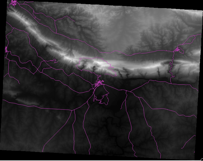
You’ll now see that the values of the raster are again properly displayed, with the darker colors representing valleys and the lighter ones, mountains:
8.2.2.1. But isn’t there a better or easier way?
Yes, there is. Now that you understand what needs to be done, you’ll be glad to know that there’s a tool for doing all of this easily.
Remove the current DEM from the Layers list.
Load the raster in again, renaming it to DEM as before. It’s a gray rectangle again...
Enable the tool you’ll need by enabling View ‣ Toolbars ‣ Raster. These icons will appear in the interface:
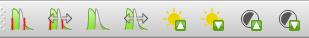
The third button from the left Local Histogram Stretch will automatically stretch the minimum and maximum values to give you the best contrast in the local area that you’re zoomed into. It’s useful for large datasets. The button on the left Local Cumulative Cut Stretch ... will stretch the minimum and maximum values to constant values across the whole image.
- Click the fourth button from the left (Stretch Histogram to Full Dataset). You’ll see the data is now correctly represented as before.
You can try the other buttons in this toolbar and see how they alter the stretch of the image when zoomed in to local areas or when fully zoomed out.
8.2.3. In Conclusion
These are only the basic functions to get you started with raster symbology. QGIS also allows you many other options, such as symbolizing a layer using standard deviations, or representing different bands with different colors in a multispectral image.
8.2.4. Reference
The SRTM dataset was obtained from http://srtm.csi.cgiar.org/
8.2.5. What’s Next?
Now that we can see our data displayed properly, let’s investigate how we can analyze it further.